-
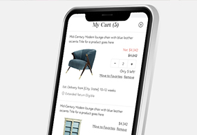
Chairish Shopping Cart
UX. Product Design. Interactive. Case Study.

-
All Grown Up Application
UX. Product Design. Mobile Design.

-
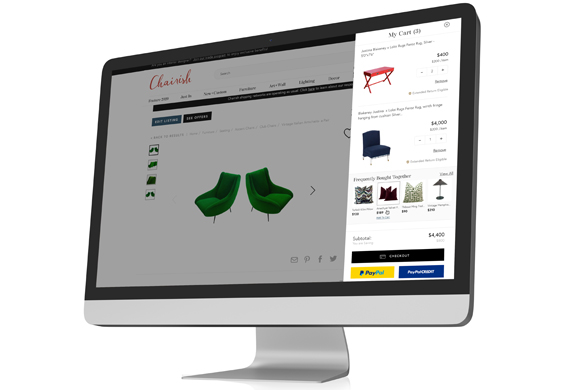
Chairish Cross-Sell Feature
UX. Product Design. Interactive. Case Study.

-
Barbell Membership Landing Page
UX. Product Design. Interactive. Case Study.

-
Chairish Estimated Delivery
UX. Product Design. Interactive. Case Study.
-
Chairish International Marketplace
UX. Product Design. Interactive. Case Study.

-
Barbell Apparel PDP Redesign
UX. Product Design. Interactive.

-
Chairish Favorite Interaction
UX. Interaction. Case Study.
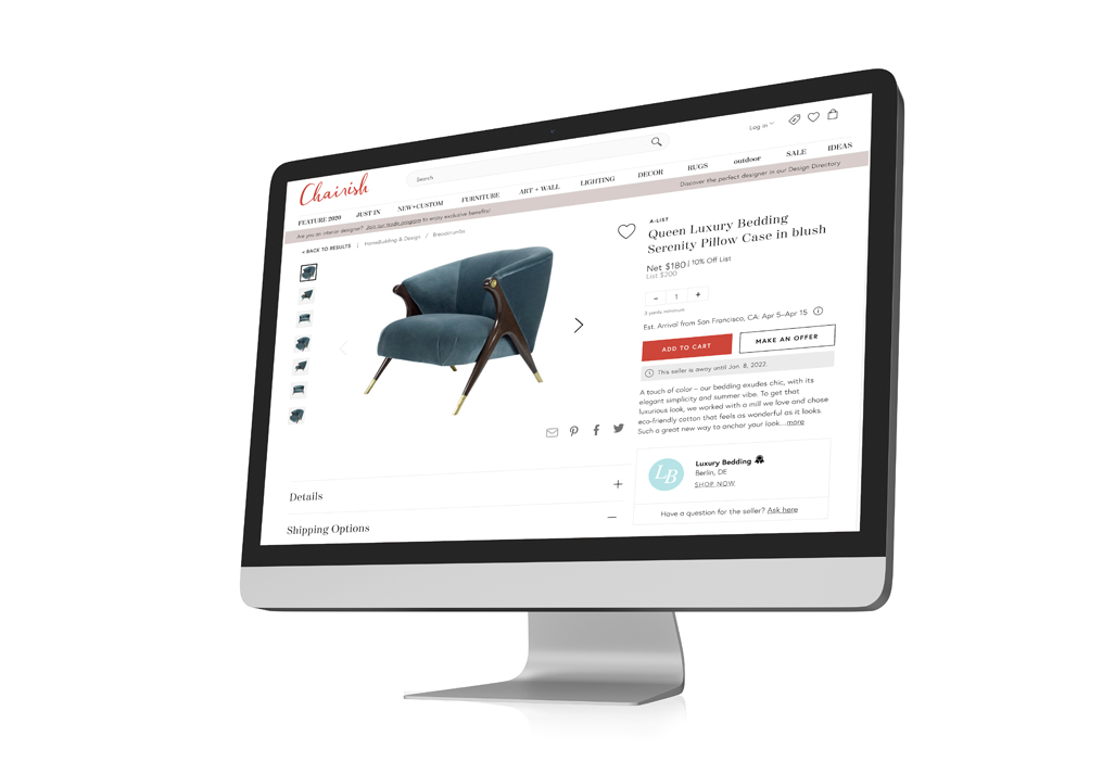
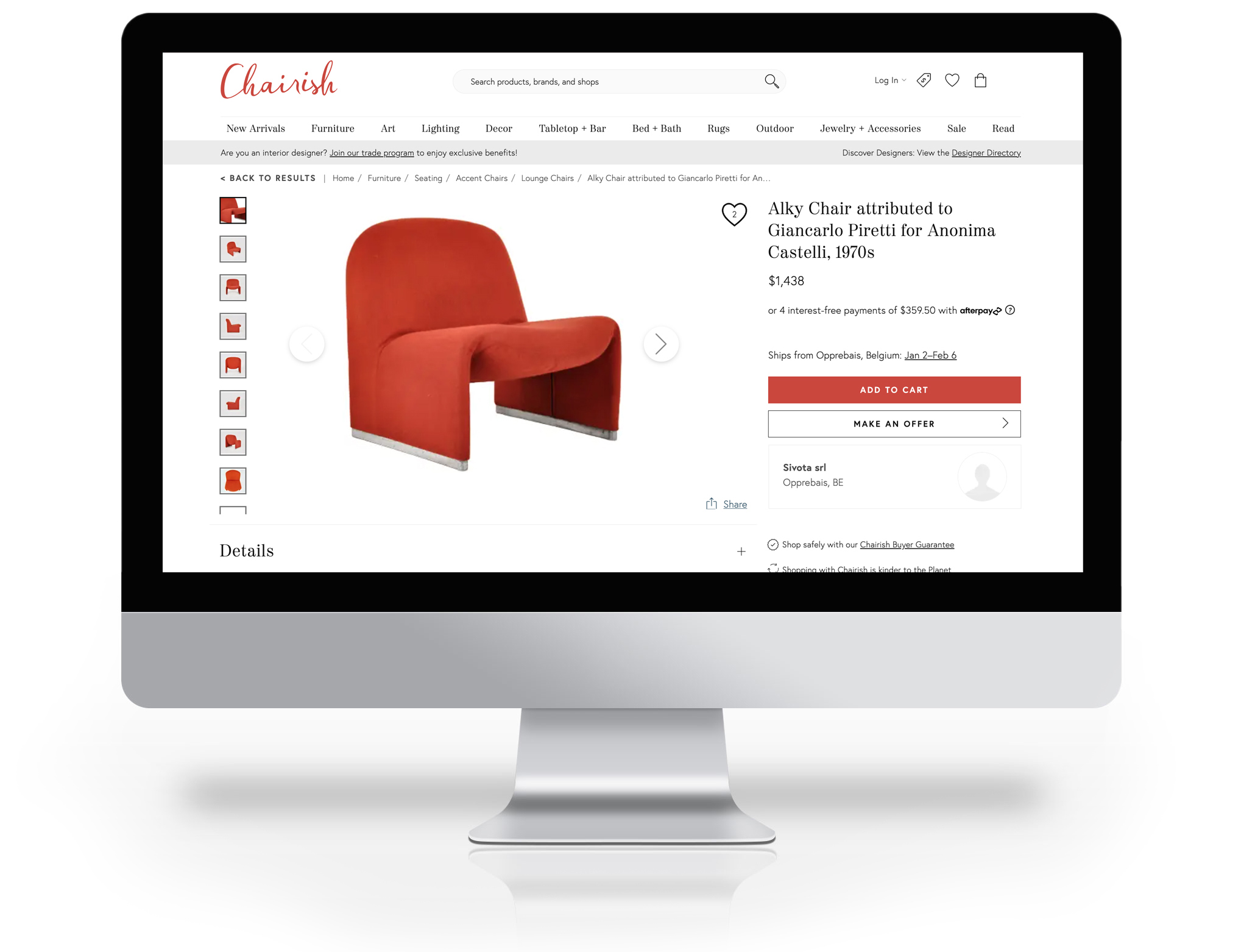
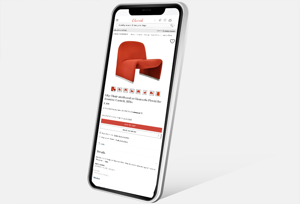
Chairish International Marketplace
In this case study, we delve into the design of the Chairish International Sales initiative, prompted by the increasing inquiries from international buyers and sellers. The project commenced in 2022, culminating in our inaugural international sale later that year.
In this project, I served as the lead designer, responsible for creating all aspects from research and wireframing to prototyping, high-fidelity designs, and quality assurance.
- April 9, 2022
- UX. Product. UI.
- Chairish
The Challenge
To expand the Chairish marketplace globally, we embarked on an initiative to facilitate sales across international borders. Prior to this project, Chairish transactions were limited to the contiguous United States. Venturing into international markets necessitated addressing various tax, duties, and shipping regulations unique to each region. Given the novelty of this endeavor for Chairish, extensive research and planning were imperative.
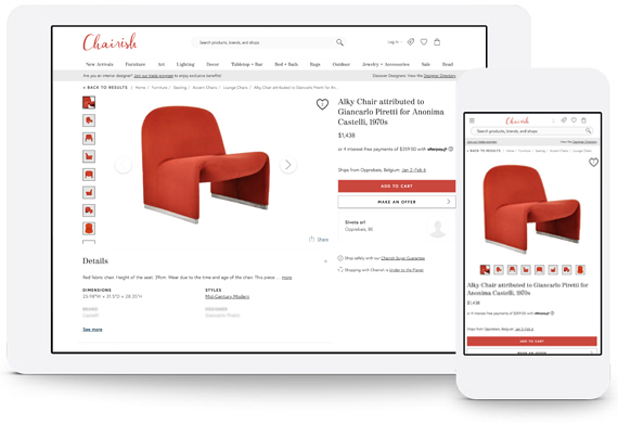
Product Overview
This design required seamless integration with existing Chairish features while also being adaptable to accommodate the distinct tax laws and shipping requirements of each country.
Problem
Facilitating international sales necessitates our design to be:
Versitile: Our design had to accommodate a myriad of tax laws, duty fees, and shipping requirements.
Cooperative: This design had to seamlessly integrate with the existing Chairish features, ensuring that users could access the necessary information to buy or sell without encountering additional friction in these processes.
Future Proof: Our design required a robust foundation that would necessitate minimal adjustments when integrating new countries into the Chairish Marketplace.
Estimated Delivery Date: One pivotal feature introduced to enhance buyer awareness was the Estimated Delivery Date. This standard eCommerce feature informs buyers about the expected delivery date of their purchases.
Overall, this product facilitates users in purchasing listings from international sellers with minimal friction during checkout, ensuring a smooth and seamless experience.
Formative Research
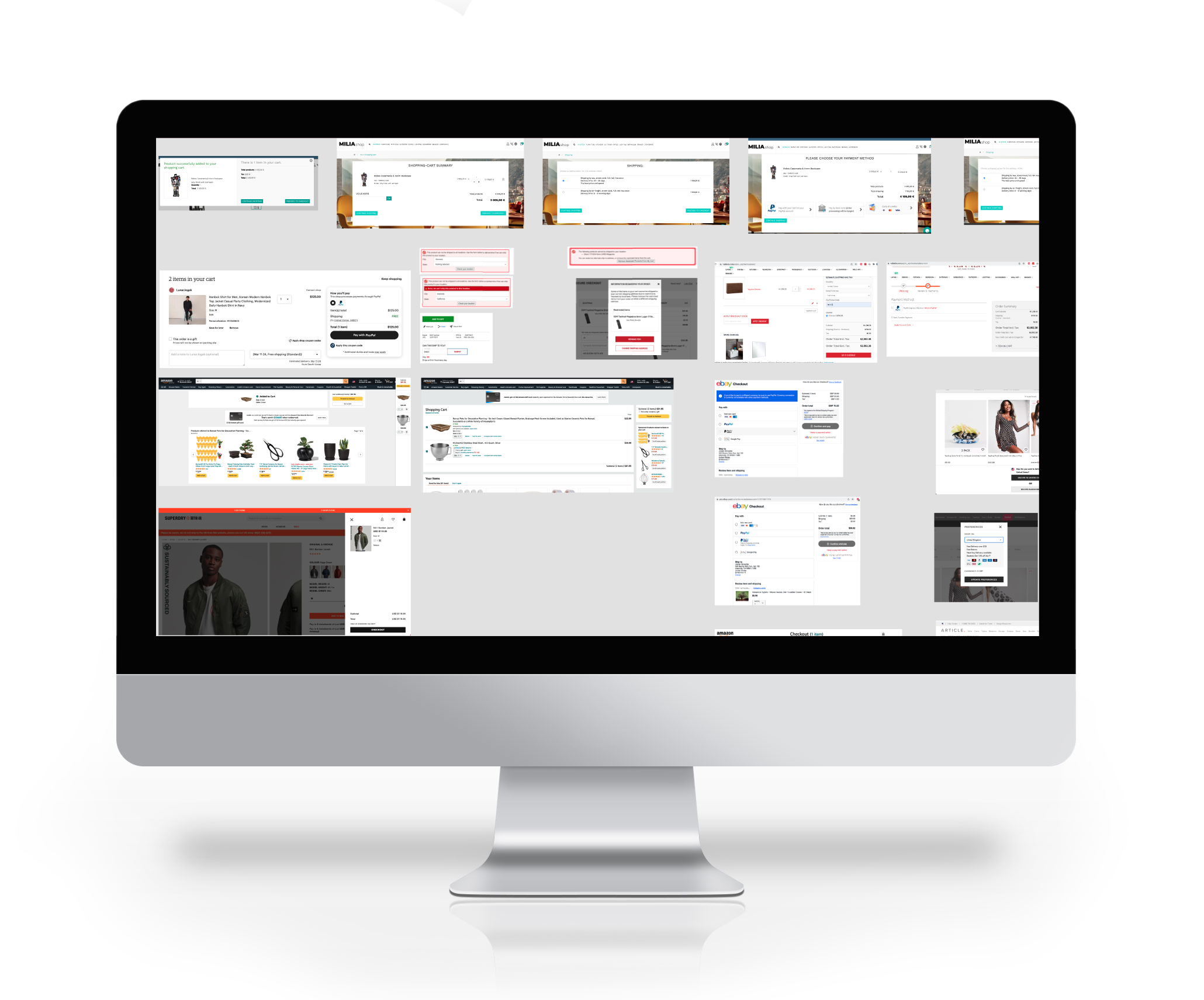
Competitive Analysis: Extensive research was conducted for this project, which proved invaluable in defining our requirements. We meticulously analyzed international sales features on our competitors' websites, allowing us to gain insights and refine our approach effectively.
Learning: This project demanded an expansion of our understanding of tax laws and duty fees, considering the potential diversity across different countries. Recognizing the need for flexibility, we aimed to design a product that could adapt to these variations seamlessly. Additionally, we identified the necessity of integrating a third-party API to accurately calculate and display the unique tax fees for each location.
Video-teleconference: This project entailed considerable scope, prompting our Product Managers to seek ways to streamline processes. One approach was to integrate a third-party API to alleviate the workload on our engineers. After evaluating various options, we opted for Avalara to facilitate tax calculations, offering a reliable solution for our needs.
The objective of our formative research was to comprehensively understand user needs, behaviors, and expectations, alongside familiarizing ourselves with the intricacies of the international shopping landscape. By delving into user preferences and gaining insights into tax laws, duties, and shipping requirements across different countries, we aimed to develop a shopping experience that seamlessly catered to user expectations and facilitated a smooth and enjoyable transaction process.
Wireframing
Once we finalized our requirements for the International Sales MVP (Most Viable Product), which were quite comprehensive, we initiated the design phase.
We initiated the wireframing process for this project as we were expanding upon existing features. We started by creating low-fidelity visual representations of webpages, which were then shared with our design team for feedback.
The feedback was iteratively applied through multiple rounds of revisions on low-fidelity digital designs. This process of wireframing the checkout experience enabled us to swiftly test and refine our ideas, ultimately minimizing the time and effort required to finalize the design.
Digital wireframes: Low-fidelity visual representations were designed, shared, and refined using Figma tools.
Refinement: Based on the feedback received, we iteratively refined and improved the wireframe, incorporating any necessary changes to enhance the user experience and meet the project objectives.
Observations
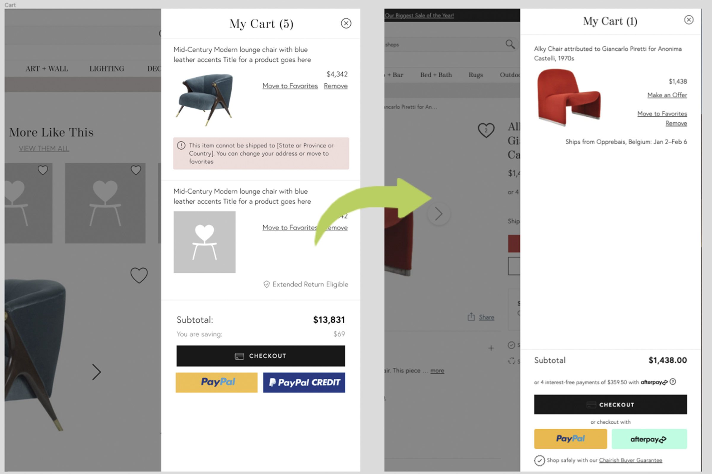
Since we were integrating new features with existing ones, the overall feedback on our wireframes was positive, with minor design adjustments incorporated into subsequent iterations. During our analysis, we identified the need to prominently feature various messaging throughout the shopping process. Additionally, we began considering how to cater to users not interested in international listings by implementing filters to enhance their experience. Our research also revealed that long shipping times and high shipping prices could discourage buyers from international purchases, prompting us to explore additional filter options to address these concerns which were designed as additional projects.
Iteration
Reflecting on our designs, we've identified several key observations that could enhance this project:
Cut Scope: Recognized the necessity of integrating a third-party API to accurately calculate tax rates for various international tax laws.
Dynamic Info: We opted to include a dynamic field that would appear if the listing's location incurred unique tax fees.
Messaging: Various laws required specific message placement, particularly for products containing rosewood and the mandate to identify the country of origin for each listing. The identification of the country of origin was further enhanced through modifications to the listing form for sellers and strategic message placement for buyers.
Overall, this product streamlines the purchasing process for users, enabling them to buy listings from international sellers with minimal checkout friction.

Prototype Phase
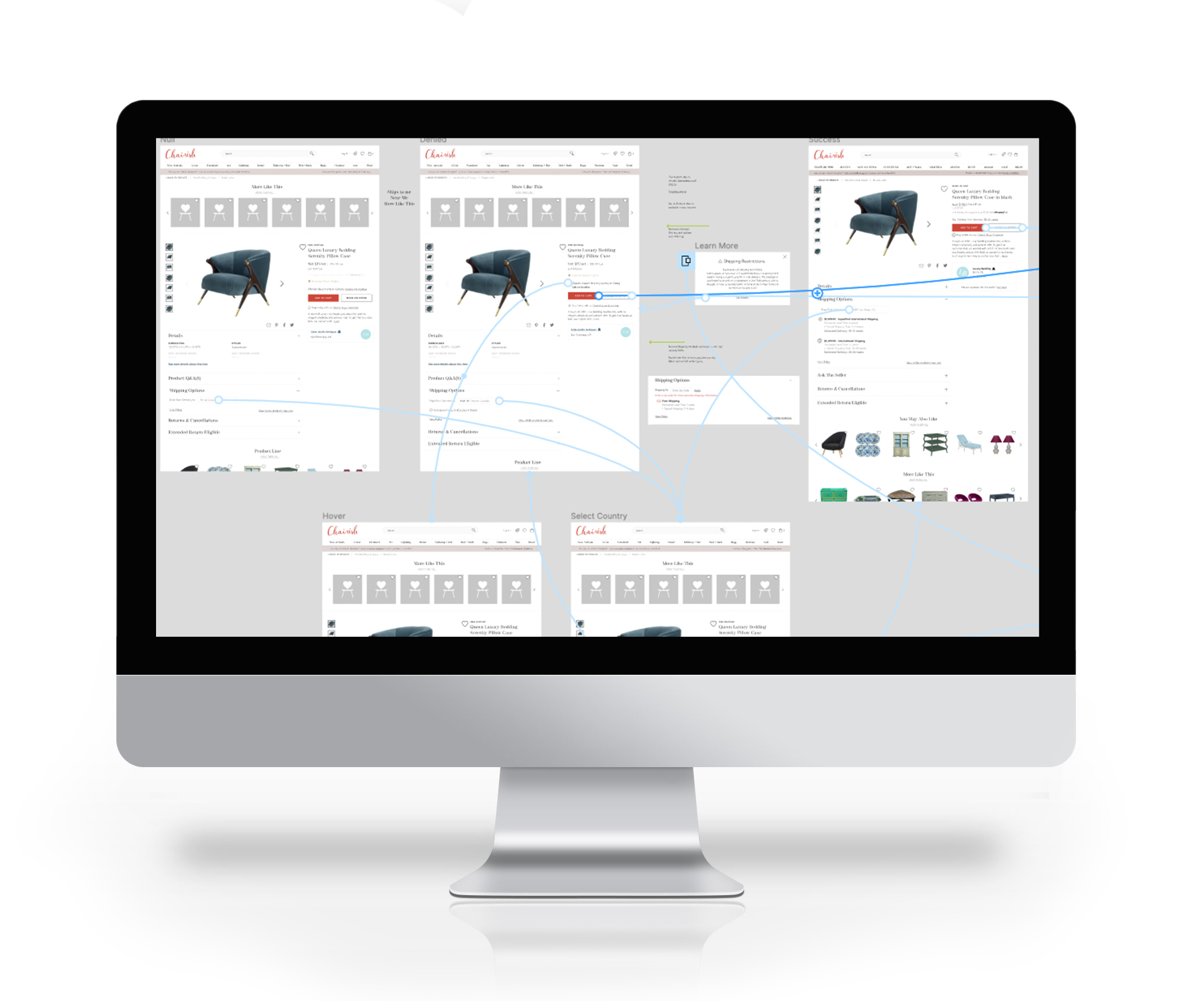
Some features in this design posed challenges for test users to visualize and understand. To address this issue, we created prototypes for these features and conducted early user testing. By building prototypes, we were able to gather feedback from users at an early stage without the need for extensive engineering resources.
View The Prototype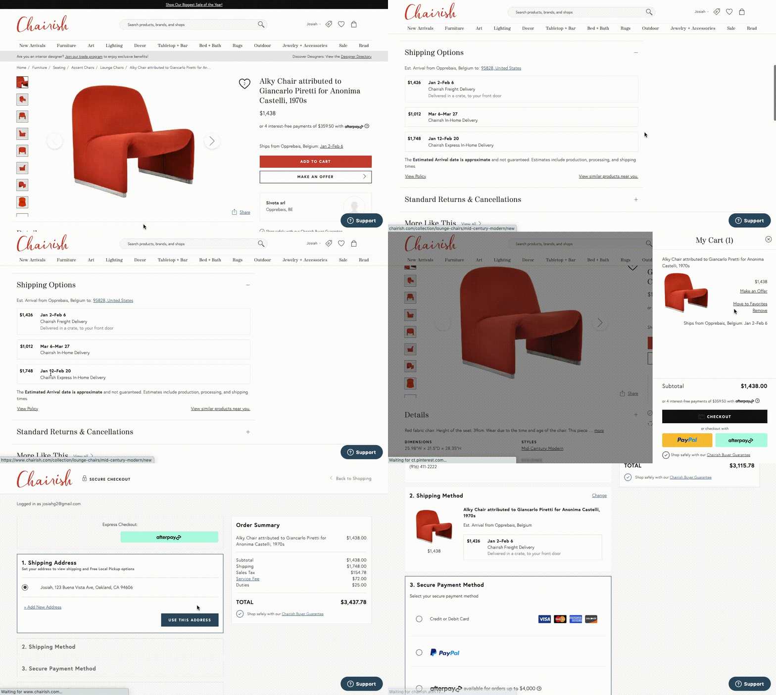

Solution
Our final solution for the Chairish International Marketplace was officially launched in 2022. Since then, sellers have been able to list items from multiple countries, while buyers have had the opportunity to purchase these items across international borders. This project has significantly broadened Chairish's reach, transforming it from a domestic United States furniture retailer into a global marketplace.
Stay tuned for the upcoming case study, which will delve into the process of developing the International Marketplace Mobile App.
Reflections
This project faced tight deadlines, leaving limited time to develop essential supporting features like Location filters and shipping filters. I believe that providing a seamless experience for domestic users, who may not have been ready or interested in seeing international listings, would have been beneficial at launch. Having additional time would have allowed us to prioritize these features and ensure a smoother experience for all users.

