-
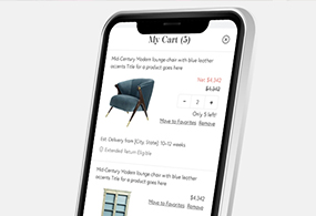
Chairish Shopping Cart
UX. Product Design. Interactive. Case Study.

-
All Grown Up Application
UX. Product Design. Mobile Design.

-
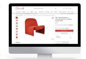
Chairish Cross-Sell Feature
UX. Product Design. Interactive. Case Study.

-
Barbell Membership Landing Page
UX. Product Design. Interactive. Case Study.

-
Chairish Estimated Delivery
UX. Product Design. Interactive. Case Study.
-
Chairish International Marketplace
UX. Product Design. Interactive. Case Study.

-
Barbell Apparel PDP Redesign
UX. Product Design. Interactive.

-
Chairish Favorite Interaction
UX. Interaction. Case Study.
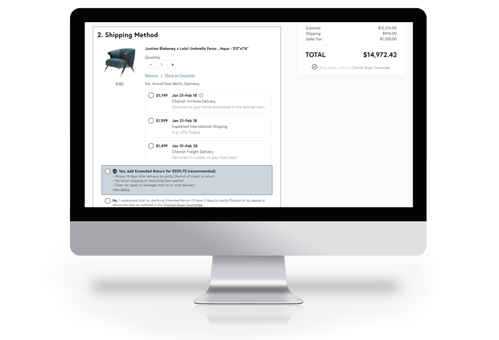
Chairish Estimated Delivery Dates
In this case study, we will examine the design of Estimated Delivery Dates and explore all associated touchpoints. It is a standard practice for e-commerce websites to present a projected delivery date, providing buyers with an anticipated timeframe for receiving their orders.
- April 12, 2021
- UX. Product. UI.
- Chairish
The Challenge
The Chairish stakeholders expressed apprehension about displaying this information to potential buyers. They were worried that extended wait times might discourage conversions, and the possibility of missed delivery dates could lead to an increase in customer service complaints. Our challenge was to persuade stakeholders that providing this information is both commonplace and essential for a positive user
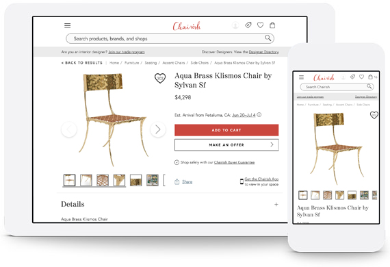
Product Overview
The design should provide users with all the required information without discouraging them from making a purchase. These design features must seamlessly integrate into the current purchase flow with minimal adjustments.
Problem
We had to present delivery estimates to potential buyers, although stakeholders were apprehensive due to concerns about potential impacts on conversion rates and increased customer service complaints.
customer service complaints.
• comprehensive research: to justify the necessity of this feature for our eCommerce platform.
• Invisible design: seamlessly integrate with the existing purchase flow without being distracting.
• Accuracy: ensuring accurate delivery dates displayed prominently.
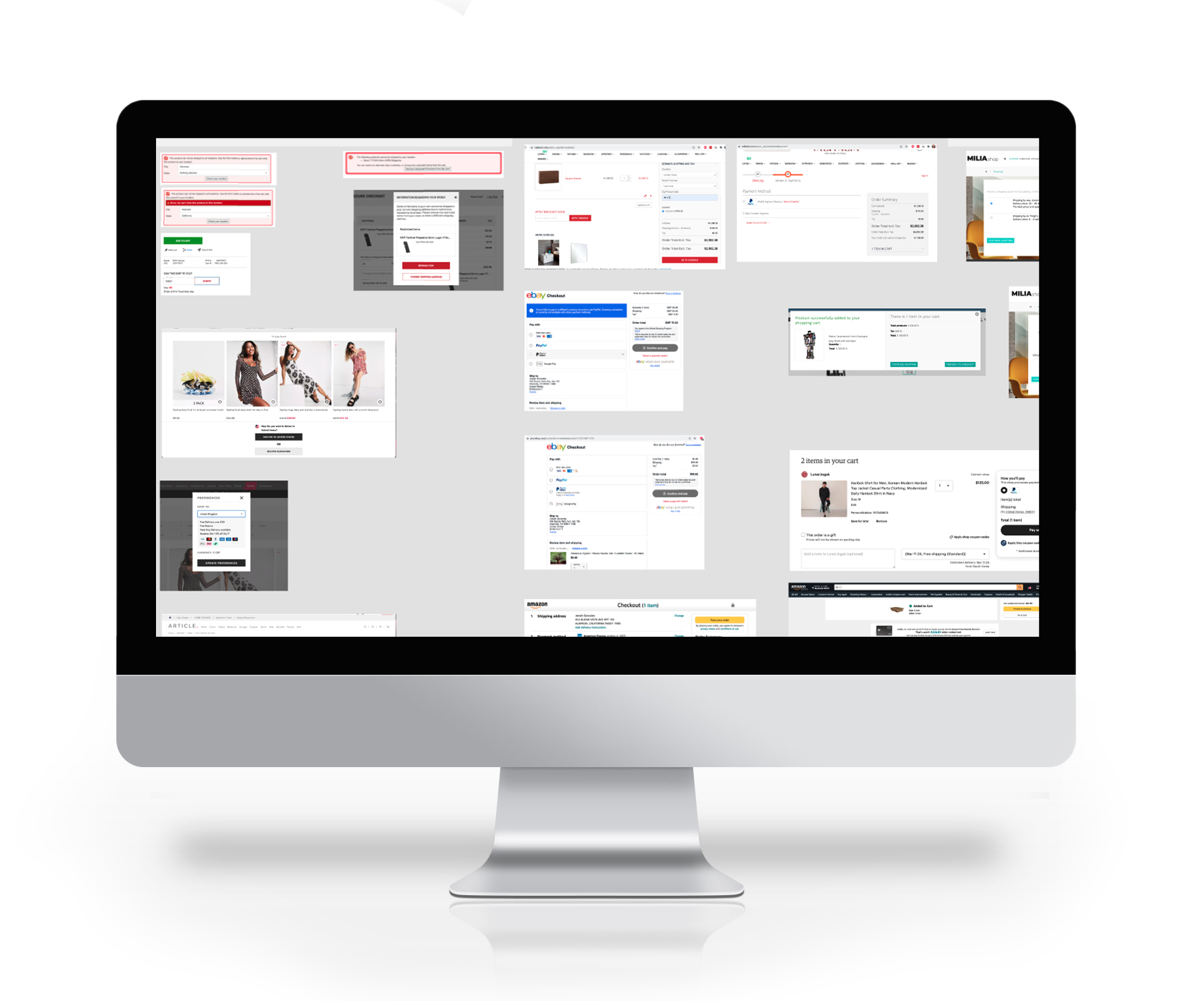
Formative Research
Competitive Analysis: Investigate the estimated delivery features implemented by different eCommerce websites to identify common trends that could inform our design.
UX Report: Investigate the estimated delivery features implemented by different eCommerce websites to identify common trends that could inform our design.
The formative research aimed to collect data on analogous features, reinforcing the necessity of the intended feature. Our research proved successful, and we received approval to commence the design phase.
Wireframing
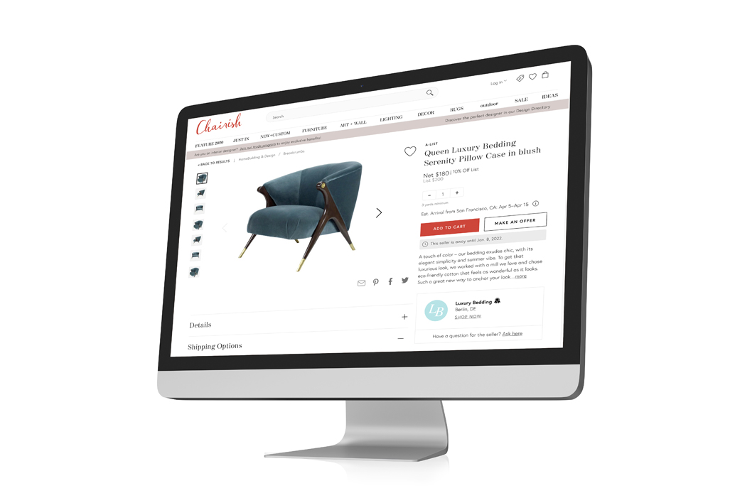
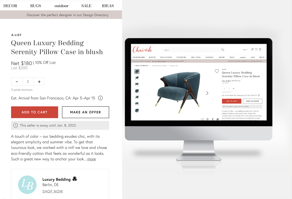
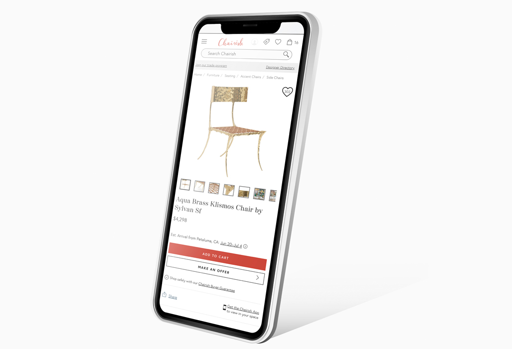
As this project involved an additional feature, we initiated the design phase with wireframes and screenshots. Recognizing the importance of seamless integration into the purchase flow, we implemented the feature subtly on selected touchpoints, including the Product Detail Page (PDP), purchase confirmation page, order list, and order details pages.
Define the scope: Clearly outlined the goals and objectives of the feature.
Explored the User's Experience: Illustrated the main features, layout, and interactions in the wireframes, considering the gathered requirements.
Refinement: Incorporated feedback to enhance the wireframe, making necessary adjustments.
Observations
The overall feedback on our wireframes was positive, with minor design adjustments incorporated in subsequent design rounds, focusing on locations and copy refinements.
Based on our Formative research we were expecting:
A standard Layout: Our competitive analysis revealed common trends in layout, consistent among most platforms in our study group.
Managing Expectations: Presenting an expected delivery date establishes clear user expectations, aiding in anticipating item arrival and preventing disappointment.
Planning and Convenience: Catering to interior designers with tight deadlines, knowing the expected delivery date allows for effective planning, especially for special occasions or time-sensitive orders.
Customer Service Reduction: Proactive delivery information provision aimed to decrease inquiries about order status, as customers having real-time information are less likely to contact customer service for updates.
Competitive Advantage: In a competitive market, offering a stress-free shopping experience through transparent delivery information becomes a distinctive factor, fostering repeat business.
Iteration
As our designs advanced, the general feedback was positive, with minor design adjustments implemented in subsequent design rounds. Despite our formative research, which advised against using time frames (e.g., 1-2 weeks) and recommended displaying actual delivery dates (e.g., Aug 12-19), stakeholders insisted on the former. As a team, we decided to proceed with time frames, intending to analyze the data and consider transitioning to specific dates in the future.
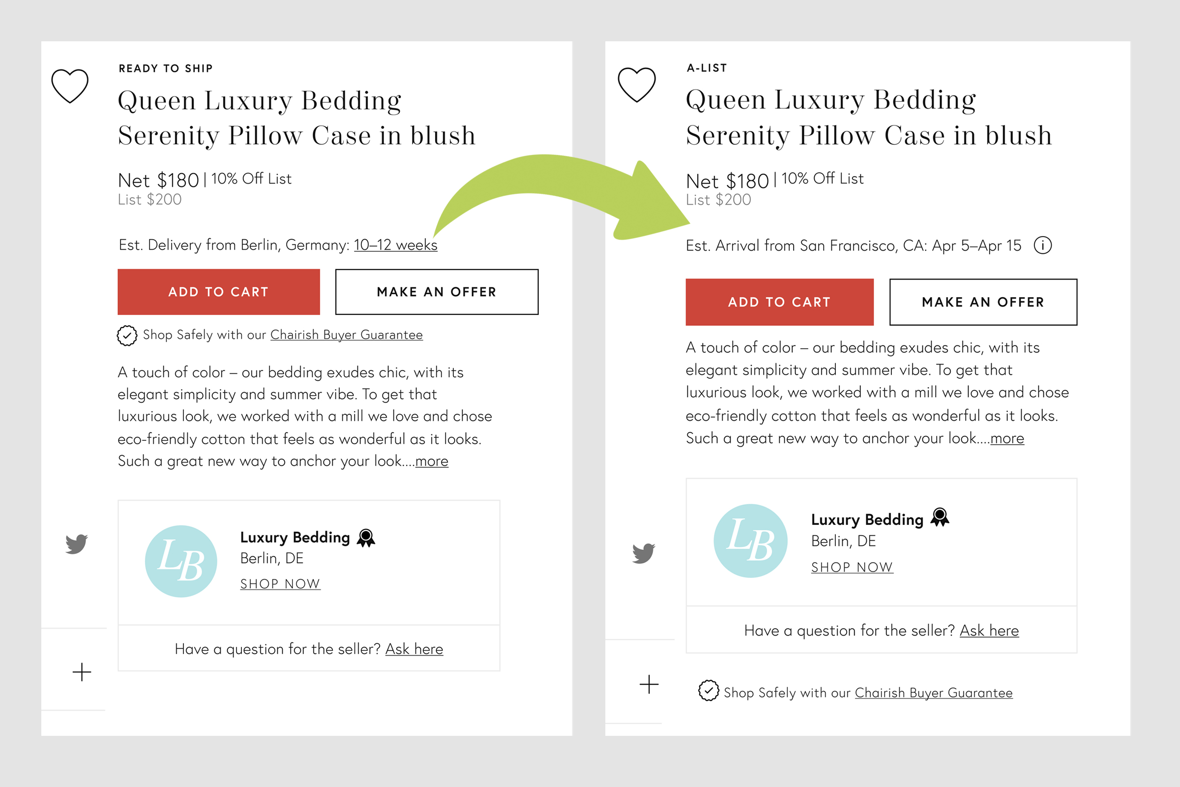

The Feedback
At this stage of the design process, the stakeholders were reassured by our compromise on delivery dates. We proceeded with implementing this feature while closely monitoring conversion data and customer service complaints associated with expected delivery times.
Solution
The finalized design solution for Chairish Estimated Delivery Time was launched with a minimal rise in customer complaints. Numerous customers appreciated the new feature, as it provided clarity about when their items would be delivered, addressing a previous lack of awareness.
Reflections
Upon revisiting this project, we implemented several enhancements, including improvements to the delivery dates. Reflecting on the experience, I acknowledge the opportunity to refine my stakeholder presentations to better convey the benefits of launching with delivery dates from the project's inception. Additionally, I recognize the importance of paying closer attention to stakeholders' initial concerns, as what initially appeared as raising awareness evolved into subtle pushback. Detecting this early on could have minimized surprises later in the project.
Another aspect I would have improved is the documentation of the project. While the design spec was solid, the engineers encountered unique shipping cases during the feature's implementation. To enhance future projects, I would invest more time in researching all existing shipping methods before the design phase. Being aware of these unique shipping options and documenting them in the spec beforehand would contribute to a smoother project flow.

