-
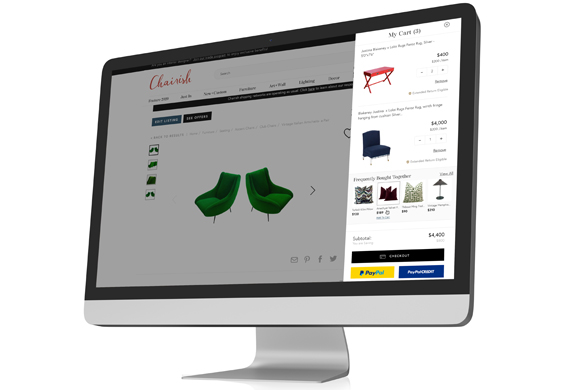
Chairish Shopping Cart
UX. Product Design. Interactive. Case Study.

-
All Grown Up Application
UX. Product Design. Mobile Design.

-
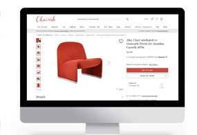
Chairish Cross-Sell Feature
UX. Product Design. Interactive. Case Study.

-
Barbell Membership Landing Page
UX. Product Design. Interactive. Case Study.

-
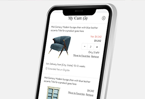
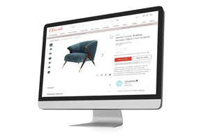
Chairish Estimated Delivery
UX. Product Design. Interactive. Case Study.
-
Chairish International Marketplace
UX. Product Design. Interactive. Case Study.

-
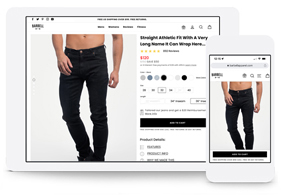
Barbell Apparel PDP Redesign
UX. Product Design. Interactive.

-
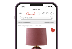
Chairish Favorite Interaction
UX. Interaction. Case Study.
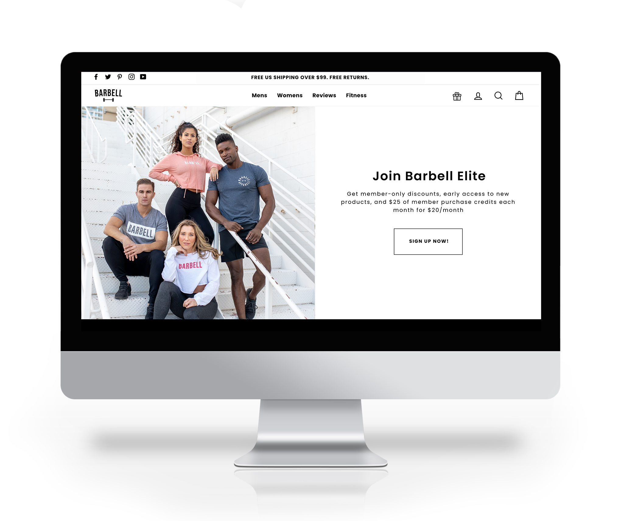
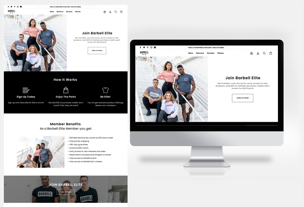
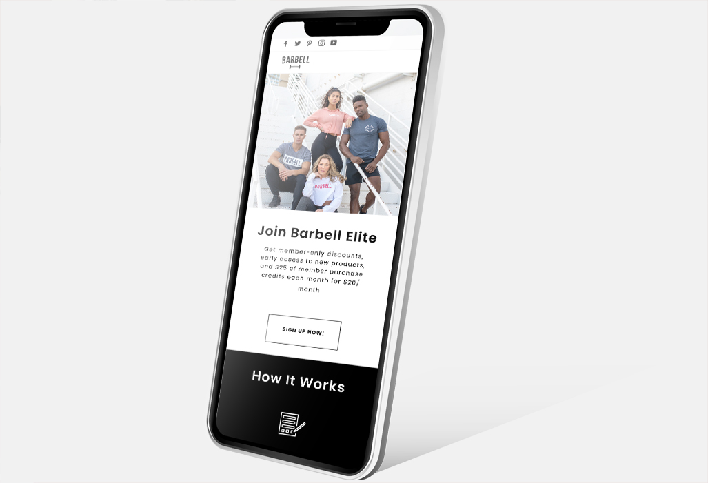
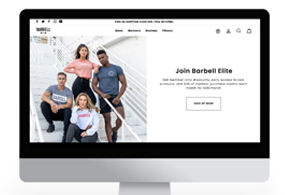
Barbell Apparel Membership Landing Page
In this case study, we'll delve into the design of the Barbell Apparel Membership Landing Page. Barbell Apparel stands out as an e-commerce provider specializing in stretchy jeans tailored for the athletic individual.
In this project, I assumed the role of lead designer, overseeing tasks ranging from research and wireframing to developing high-fidelity designs and creating detailed spec annotations.
- June 13, 2022
- UX. Product. UI.
- Barbell Apparel
The Challenge
The stakeholders at Barbell Apparel sought to introduce a membership subscription for their customers. Our assignment involved crafting a visually compelling representation of this membership through a dedicated landing page.
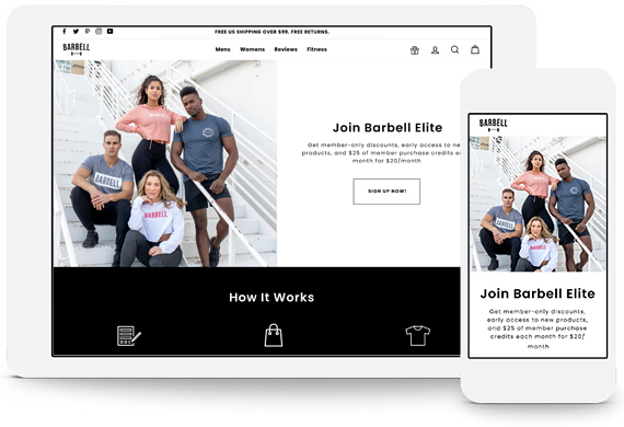
Product Overview
The Barbell Apparel Membership Landing Page offers comprehensive information about the subscription service, including a detailed Frequently Asked Questions section, a breakdown of the paid plans, and multiple Calls to Action (CTAs) prompting users to sign up.
Problem
We required a landing page that strikes a balance between being inviting and informative, encouraging users not only to learn about the subscriptions but also to sign up. This page encompasses:
An outline of the Subscription service features:
• Frequently Asked Questions section
• Several CTAs to sign up are featured in locations throughout the page.
• Group photography to appeal to the psychology of belonging to the team.
• Overall, it allows users to research the subscription service and make an informed decision to sign up.
Formative Research
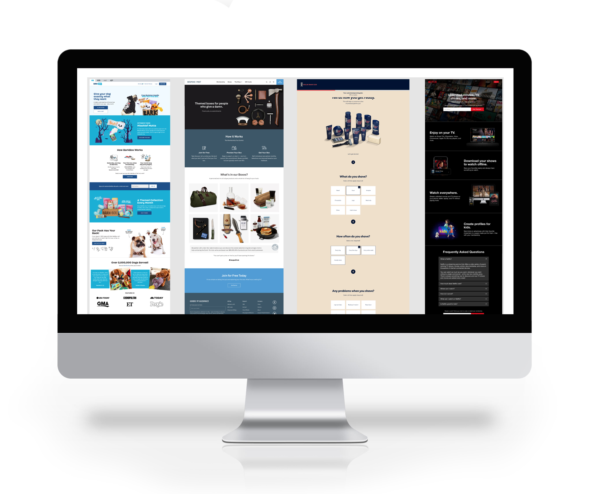
Competitive Analysis: Analyze the landing pages of different membership services to identify common trends that could potentially influence future subscribers.
The objective of formative research was to delve into the psychology behind landing pages, seeking insights into how information is presented and what elements may encourage users to subscribe.
Wireframing
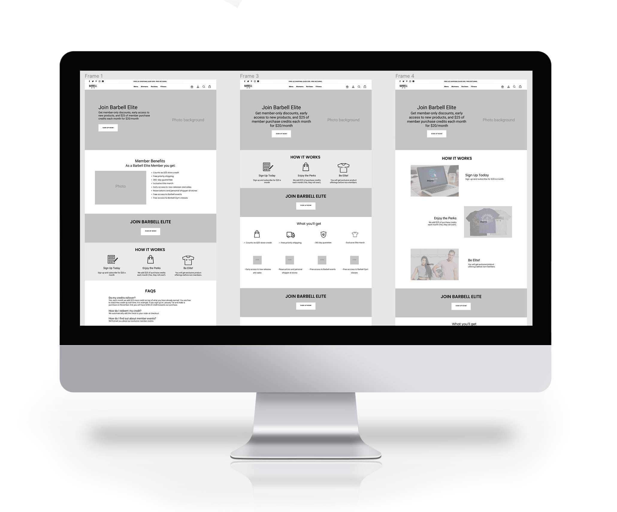
In this project, we engaged in several rounds of wireframing, beginning with the initial step of sketching our ideas on paper. This process enabled us to create low-fidelity visual representations of the website or application interface, which were then shared among our design team for critique and feedback. Over several iterations, incorporating feedback from sketches and low-fidelity digital designs, we refined our wireframes. This iterative wireframing process allowed us to quickly test and refine ideas, ultimately reducing the time and effort required to finalize the design. We ultimately settled on three options to present to the stakeholders, as depicted on the left.
Define the scope: Define the wireframe's goals and objectives with clarity, outlining its intended purpose and the specific outcomes it aims to achieve.
Sketching: Sketch out the primary features, layout, and interactions of the wireframe, ensuring alignment with the collected requirements and considering user needs and preferences.
Digital wireframes: Convert the sketches into digital wireframes, using tools such as Figma.
Refinement: Based on the feedback received, iteratively refine and enhance the wireframe, incorporating any necessary adjustments to ensure alignment with user needs, design objectives, and stakeholder requirements.
Observations
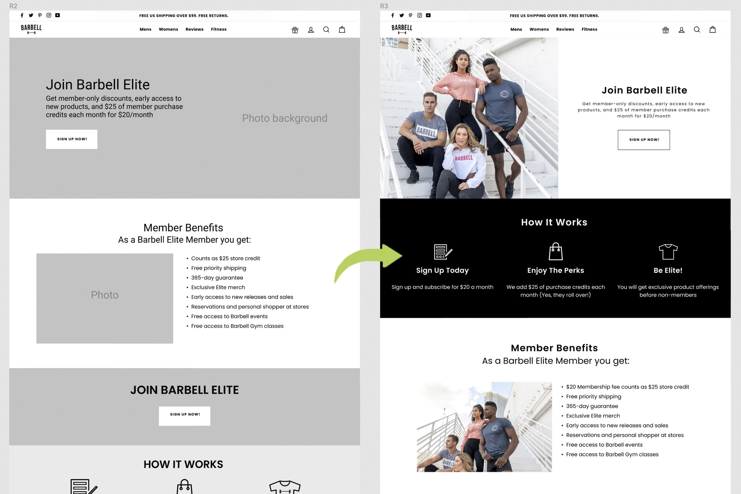
Overall, the feedback on our wireframes was positive, with minor design adjustments implemented in subsequent iterations. Initially, stakeholders emphasized the use of numerous icons throughout the page. However, during our presentation, we advocated for a balanced approach, incorporating both iconography and team photography to resonate with users psychologically.
Based on our Formative research we were expecting:
A standard Layout: After conducting competitive analysis, we observed several recurring layout trends across our study group, suggesting a consistent approach adopted by most competitors.
Simplicity: Stakeholders expressed a desire for increased visual elements on the page. However, we successfully achieved a visual balance between copy, iconography, and photos.
Iteration
With our formative research and initial presentation concluded, we proceeded to design the high-fidelity landing page. Below are several versions of our landing page. Iterations for this project were minimal thanks to the thorough research and wireframing efforts invested in the design phase.
Prototype Phase
In our secondary research phase, we employed various tools for user testing, including the creation of a working prototype using Figma. This prototype provided stakeholders with an immersive experience, allowing them to interact with the page as if it were live on a desktop device. Building the prototype in Figma enabled us to gather feedback from stakeholders at an early stage without the need for extensive engineering resources.
View The Prototype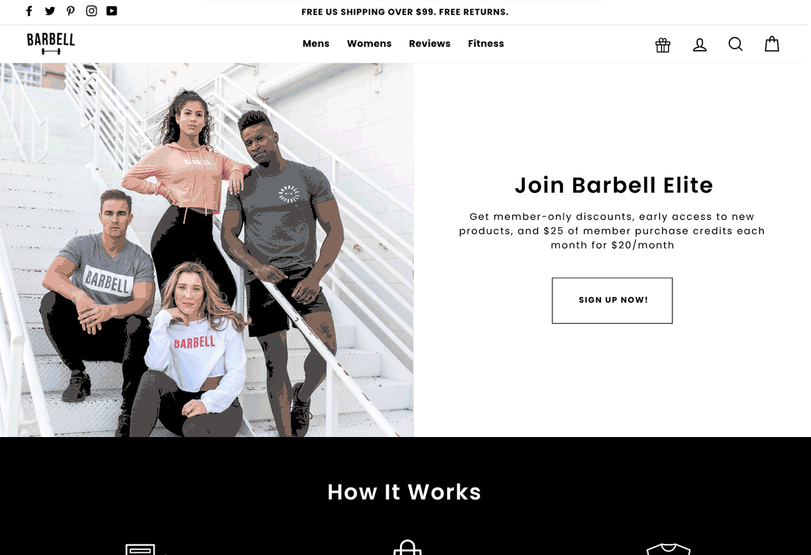
The Feedback
At this stage of the design process, stakeholders expressed general satisfaction with the design, with feedback mainly revolving around minor adjustments such as image and icon substitutions. With approval from stakeholders, engineers were given the green light to commence building the page. The handoff process went smoothly, facilitated by the simplicity of the design and the comprehensive annotations provided in Figma.
Solution
Our final solution for the Barbell Membership Landing Page was successfully designed, built, and marketed. Given that this membership concept was entirely new, we couldn't conduct tests against previous data. Nonetheless, the page performed well, particularly in alignment with marketing initiatives..
Reflections
Reflecting on our product, one component that is missing and may be useful to sign up more users is a chat widget or place for curious users to ask a question. This feature may be a valuable funnel in gathering more potential memberships. Due to staffing resources, this was not an option.