-
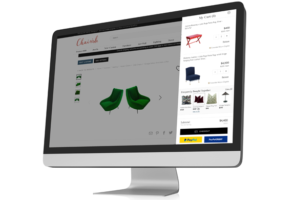
Chairish Shopping Cart
UX. Product Design. Interactive. Case Study.

-
All Grown Up Application
UX. Product Design. Mobile Design.

-
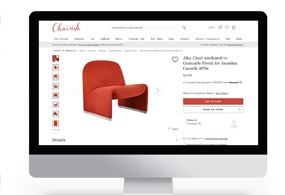
Chairish Cross-Sell Feature
UX. Product Design. Interactive. Case Study.

-
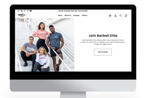
Barbell Membership Landing Page
UX. Product Design. Interactive. Case Study.

-
Chairish Estimated Delivery
UX. Product Design. Interactive. Case Study.
-
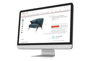
Chairish International Marketplace
UX. Product Design. Interactive. Case Study.

-
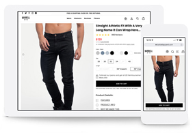
Barbell Apparel PDP Redesign
UX. Product Design. Interactive.

-
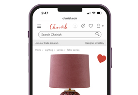
Chairish Favorite Interaction
UX. Interaction. Case Study.
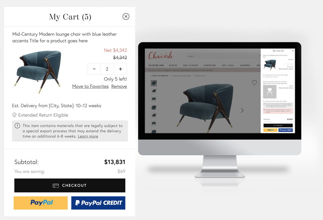
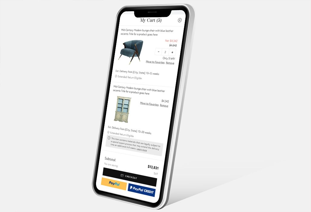
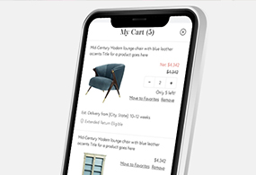
Chairish Shopping Cart
In this case study, we'll delve into the design of the Chairish Shopping Cart, an integral aspect of Chairish's online marketplace specializing in home furnishings and art. Chairish serves as a versatile platform, facilitating the buying and selling of furniture, offering interior design services, and providing access to millions of unique listings. Prior to the shopping cart design, buyers were constrained to checking out one item at a time.
In this project, I held the sole responsibility as the designer, overseeing every aspect from research and wireframing to user testing, prototyping, final design, and quality assurance.
- April 22, 2019
- UX. Product. UI.
- Chairish
The Challenge
To boost the Average Order Value (AOV), our team embarked on a mission to devise effective solutions. Among the strategies explored was the creation of a shopping cart feature enabling buyers to purchase multiple listings simultaneously. Prior to this initiative, Chairish operated as a platform geared towards single-item transactions, owing to the unique nature of its antique listings and the diverse geographic locations of sellers across the United States.
Product Overview
We sought a shopping cart design that seamlessly combined simplicity with intuitiveness, enabling buyers to effortlessly purchase multiple listings at once. Given its prevalence across most ecommerce platforms, we aimed for a cart design that adhered to widely recognized and intuitive interface patterns.
Problem
A website that limits users to checking out one item at a time poses several drawbacks or inconveniences:
Increased shopping cart abandonment: Customers aiming to buy multiple items might encounter frustration and may abandon their carts if compelled to repeat the checkout process for each item. Consequently, this scenario can result in lost sales for the business.
Reduced customer satisfaction: Customers anticipate being able to complete their purchases for all desired items in a single transaction. Requiring multiple checkouts can be laborious and time-consuming, potentially resulting in customer dissatisfaction.
Missed opportunities for cross-selling and upselling: Allowing customers to checkout with multiple items at once presents our platform with the chance to cross-sell and upsell related products, potentially resulting in boosted sales and average order value.
Inefficiency for the business: Handling multiple orders for the same customer is inefficient for the business and can increase the likelihood of errors in order fulfillment.
In essence, enabling users to check out with multiple items at once stands as a best practice for e-commerce ventures. This approach not only boosts sales but also enhances customer satisfaction while streamlining order fulfillment processes.
Formative Research
Analytics: Examine website analytics data meticulously to gain insights into user behavior within the shopping cart, delving into metrics such as drop-off rates, average session duration in the cart, and conversion rates..
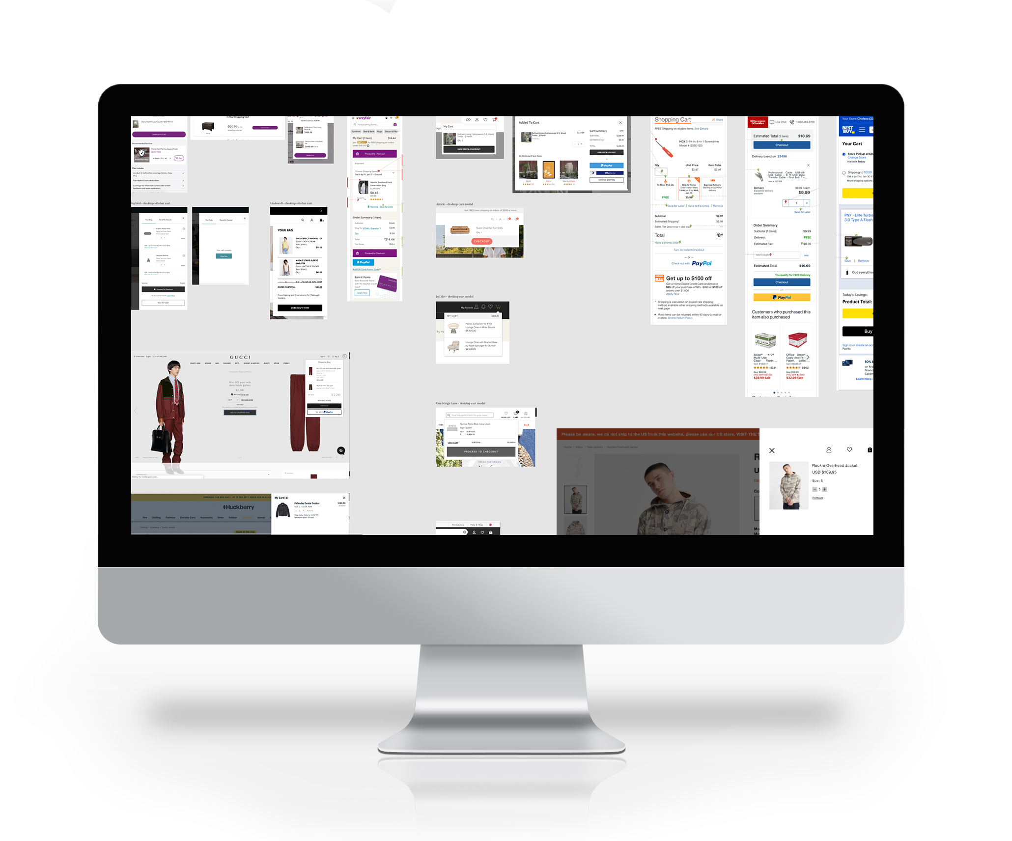
Competitive Analysis: Analyze competitors' shopping carts thoroughly to glean valuable insights into effective strategies and areas for enhancement.
The aim of formative research was to collect comprehensive data on user needs, behaviors, and expectations to guide the shopping cart design process. Through this understanding of user needs and challenges, we crafted a shopping cart geared towards delivering a seamless and delightful experience, thereby fostering heightened engagement and driving sales.
Secondary Research
Our secondary research was conducted at various points during the design process.
Surveys: During the research phase of this project, we employed surveys and conducted user interviews to collect valuable data on user shopping behaviors, preferences, and challenges with shopping carts. This approach enabled us to glean comprehensive insights into users' experiences, motivations, and expectations, informing our design decisions effectively.
User testing: We conducted two rounds of user testing during the development process. The first session took place after completing a functional prototype in Figma, while the second session occurred after finalizing the product in a testing environment. In both tests, we observed users interacting with the shopping cart, pinpointed any pain points or challenges they encountered, and gathered valuable feedback for potential enhancements.
Analytics: We thoroughly analyzed the analytics at multiple checkpoints post-launch, focusing on understanding user interactions with the shopping cart. Our analysis included examining drop-off rates, average time spent in the cart, total number of items in the cart, and conversion rates.
Observations
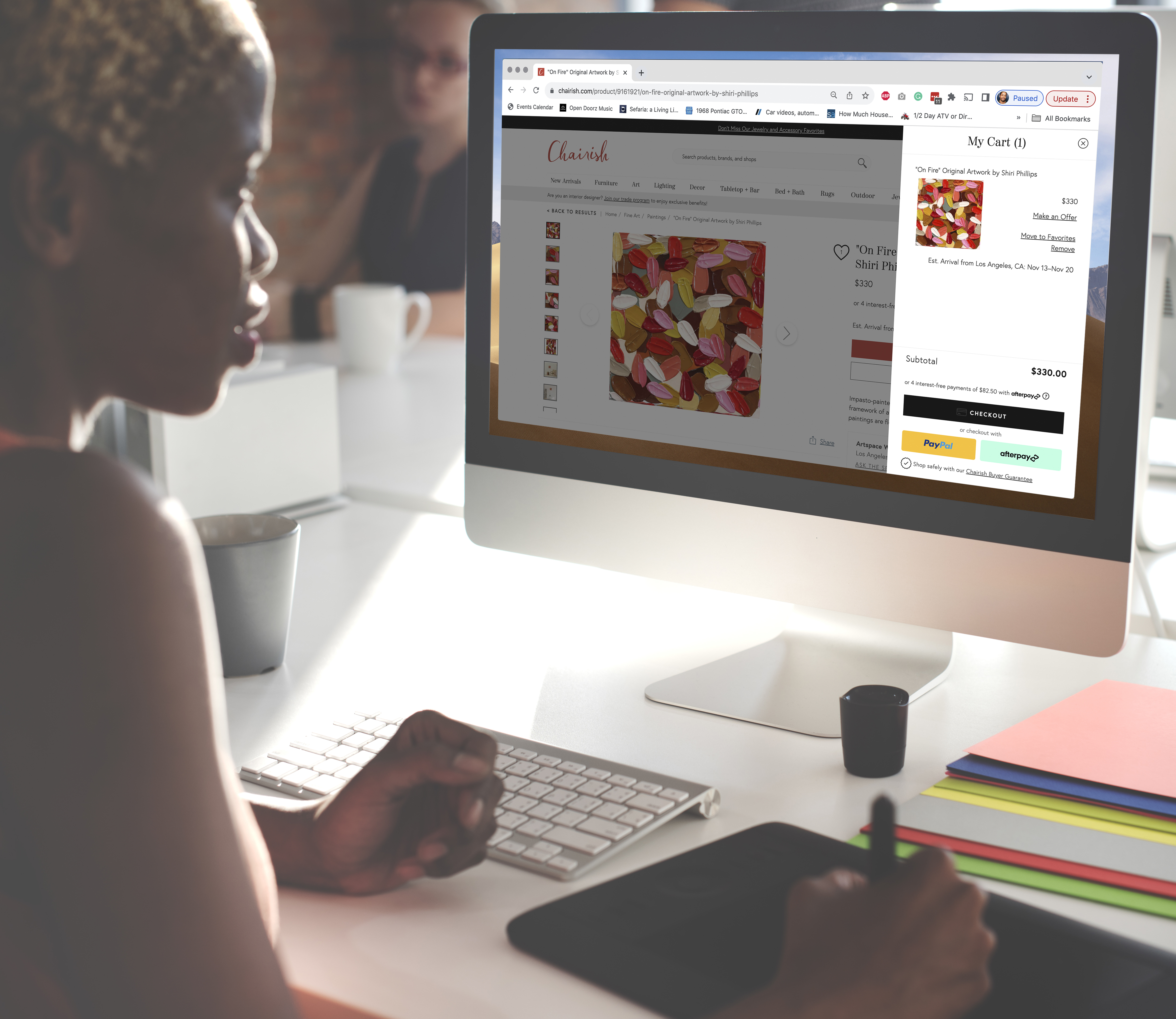
We implemented the cart as a drawer to ensure it seamlessly integrated with the shopping process, minimizing interruptions. Users praised the cart's user-friendly interface, yet initial design complexity prompted revisions based on user feedback, enhancing overall usability.
Based on our Formative research we were expecting:
Increased convenience: This shopping cart enables users to add multiple items, streamlining the checkout process for enhanced convenience. Its intuitive design minimizes friction, increasing the likelihood of successful purchases with a seamless checkout experience.
Improved user experience: Introducing a multiple-item shopping cart improves the user experience by offering a clear overview of all items in the cart, displaying the total cost, and allowing for easy modification of selections..
Increased sales: Our research indicate that incorporating a shopping cart feature leads to increased conversion rates. When users can conveniently view desired items and their associated costs, they are more inclined to complete purchases.
Ability to compare items: By implementing this shopping cart feature, users can compare various items side by side, empowering them to make well-informed purchasing decisions.
Tracking of customer behavior: By incorporating this shopping cart feature, we gain valuable insights into customer behavior and purchasing habits, enabling us to optimize the shopping experience for our users.
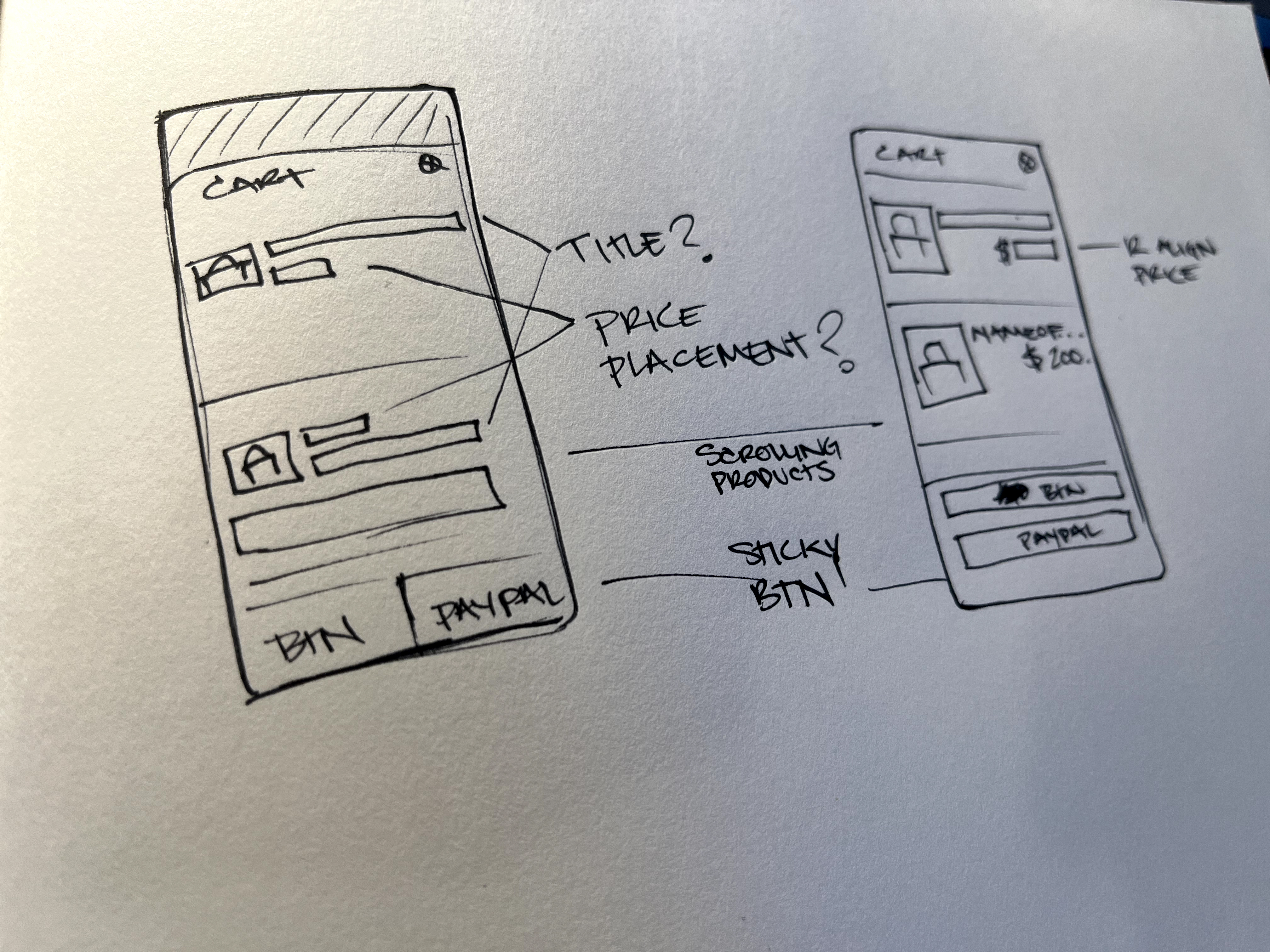
Wireframe Phase
In this project, we underwent multiple iterations of wireframing, beginning with pen-and-paper sketches to conceptualize our ideas. This initial phase enabled us to generate low-fidelity visual representations of the website or application interface, which were then shared with our design team for critique and feedback. Over several rounds of revisions, incorporating feedback from both sketches and low-fidelity digital designs, we refined our concepts. Utilizing wireframes for the cart facilitated rapid testing and iteration, ultimately streamlining the process and expediting the final design.
Throughout the process of wireframing, we were able to:
`Define the scope: Precisely outline the goals and objectives of the wireframe, specifying the intended outcomes it should accomplish.
Sketching: Outline the primary features, layout, and interactions of the wireframe, ensuring alignment with the collected requirements.
Digital wireframes: Convert the sketches into digital wireframes, using Figma.
Refinement: Based on the feedback received, iterate on the wireframe, refining and enhancing it to address any identified issues or areas for improvement.
Prototype Phase
In our secondary research phase, we leveraged various tools for user testing, including the creation of a functional prototype using Figma. This prototype enabled users to simulate adding items to their cart and experience the shopping process firsthand. Developing this prototype was crucial as it provided us with early user feedback without the need for significant engineering resources. This approach was valuable in obtaining insights before fully committing to a production environment.
View The Prototype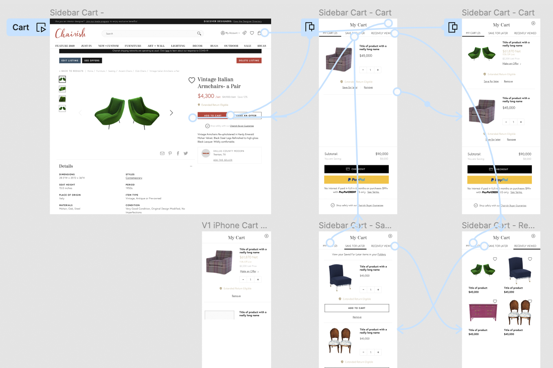

The Feedback
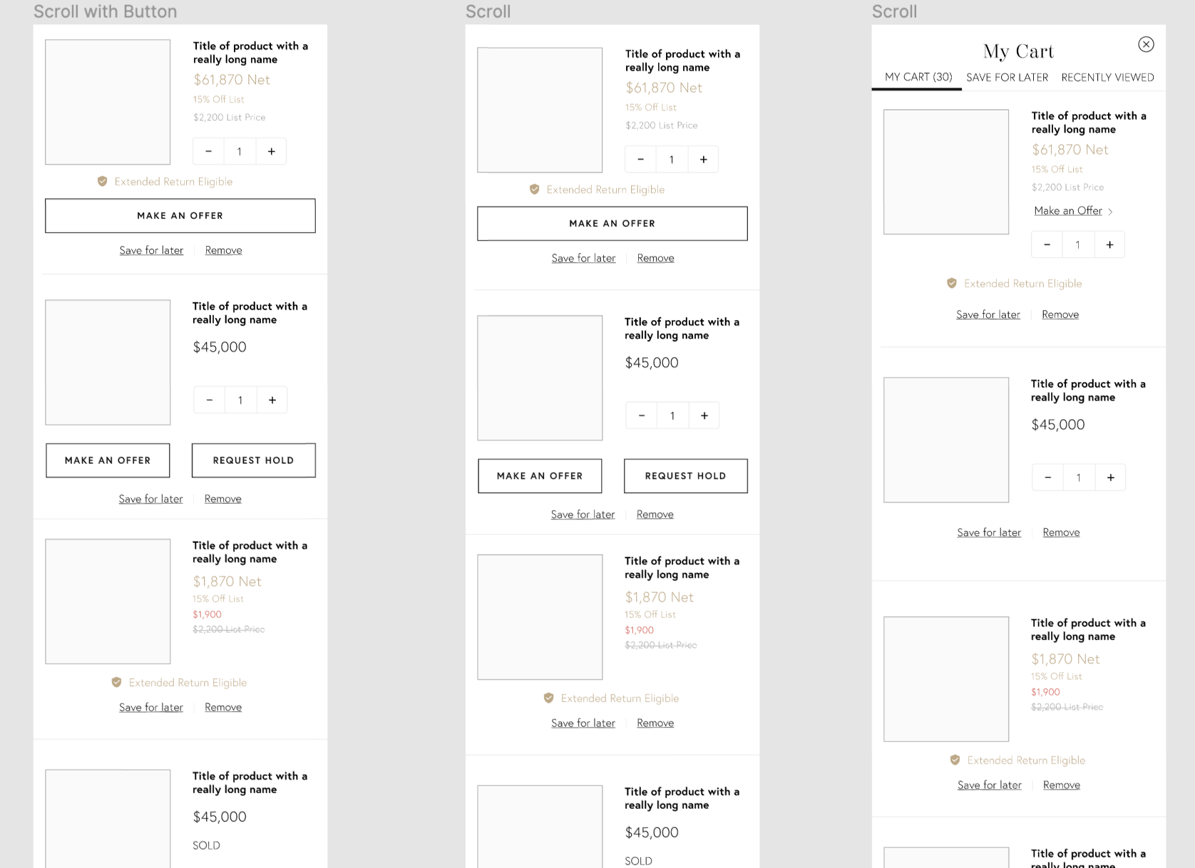
Through our user testing process, we proactively addressed issues before they escalated, saving valuable time and resources. By conducting thorough testing, we identified potential challenges early on and iterated on our shopping cart design accordingly. One key insight we gained was the need to streamline the cart's features, as feedback indicated that attempting to incorporate too many elements, such as "Save for Later" and "Recently Viewed," could overwhelm users, as depicted in the iteration phase below.
Iteration
Reflecting on our secondary research findings, we recognized the importance of simplifying our shopping cart design for optimal user experience. Taking this insight into account, we iteratively refined our design based on user feedback, bringing us closer to our final product. Through continuous testing and refinement, we aimed to deliver a seamless and gratifying experience, ultimately driving increased engagement and satisfaction. The early designs on the left, depicted below, initially featured complexity with tabs for "Save for Later" and "Recently Viewed." However, based on user feedback, we made the decision to remove these features and consider their integration in future iterations.

Solution
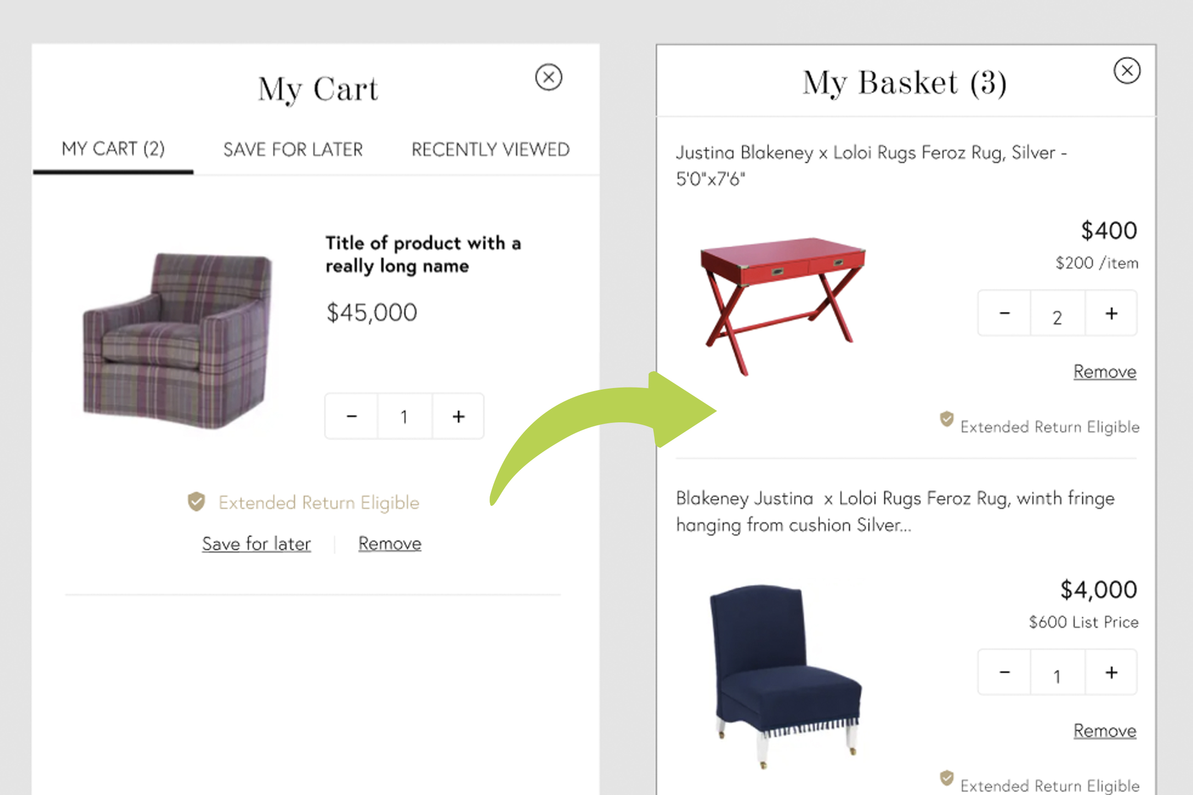
Our final iteration of the Chairish Shopping Cart has remained unchanged for several years, indicating the effectiveness and durability of our design process. The shopping cart successfully fulfilled all our requirements, enabling users to purchase multiple listings in a single transaction, streamlining the checkout process, and boosting the Average Order Value (AOV) per transaction. The analytics provided clear evidence of its success; within days of implementation, we observed a remarkable 38% increase in AOV, with continued growth thereafter. Additionally, we gained valuable insights into user behavior, noting a tendency for users to add multiple similar listings to compare before making a purchase. In response, we developed several solutions, including the introduction of folders, multiple payment options, and an "add to favorites" feature. Overall, the feedback on our final solution was overwhelmingly positive, affirming the efficacy of our design approach.
“I used the cart this weekend and it was slick, really easy to use, whatever you guys are doing in design keep it up!”
-Anna, Co-Founder and President
Reflections
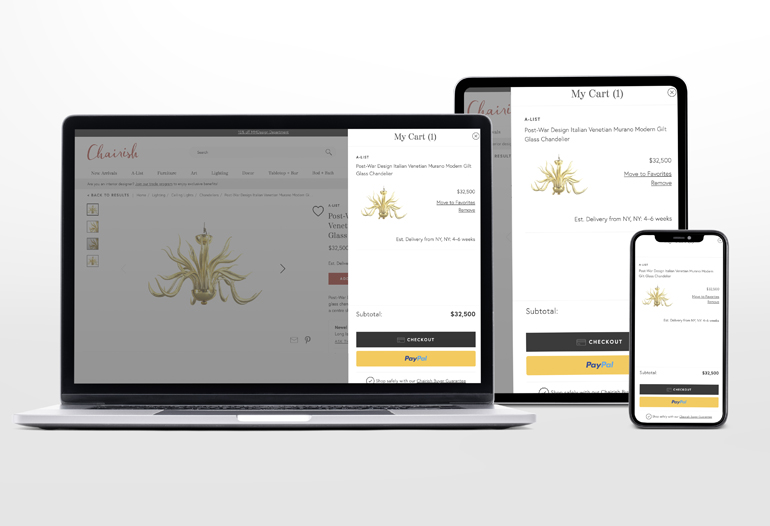
Upon evaluating our product, one aspect that stands out for potential optimization is ensuring seamless continuity between the Desktop Web and the Mobile App platforms. Valuable feedback, particularly from a senior designer, suggested relocating the cart icon to the main navigation of the mobile app. In hindsight, I recognize the importance of advocating for consistency across both Web and Mobile App interfaces.
Moving forward, I aim to allocate more time to gather comprehensive requirements from stakeholders. While the project's requirements evolved iteratively through the design process, I believe that engaging stakeholders early on, presenting initial concepts, and soliciting their input could offer a more holistic perspective on project objectives.
Through A/B testing, we observed significant enhancements in Average Order Value (AOV), accompanied by a modest increase in conversion rates. Additionally, we identified emerging user behaviors that presented opportunities for introducing innovative design features. Notably, the stability of the Chairish shopping cart design over several years underscores the efficacy of our design process. This stability serves as a testament to the solidity of our foundational approach, affirming the success of our design endeavors.