-
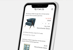
Chairish Shopping Cart
UX. Product Design. Interactive. Case Study.

-
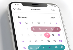
All Grown Up Application
UX. Product Design. Mobile Design.

-
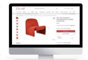
Chairish Cross-Sell Feature
UX. Product Design. Interactive. Case Study.

-
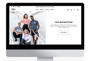
Barbell Membership Landing Page
UX. Product Design. Interactive. Case Study.

-
Chairish Estimated Delivery
UX. Product Design. Interactive. Case Study.
-
Chairish International Marketplace
UX. Product Design. Interactive. Case Study.

-
Barbell Apparel PDP Redesign
UX. Product Design. Interactive.

-
Chairish Favorite Interaction
UX. Interaction. Case Study.
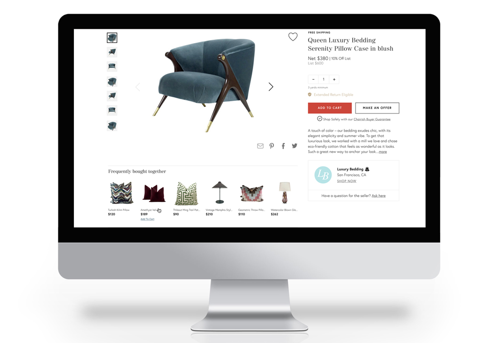
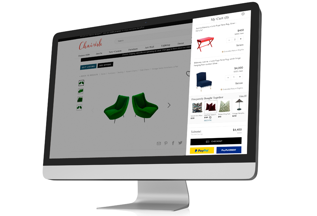
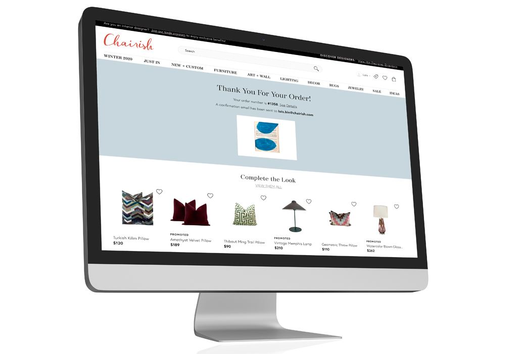
Chairish Cross-Selling Feature
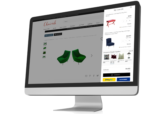
The aim of this project was to enhance revenue generation by seamlessly recommending complementary products to customers throughout their buying experience.
In this project, I held the sole responsibility as the product designer, overseeing every aspect from research and wireframing to user testing, prototyping, final design, and quality assurance.
- May 12, 2023
- UX. Product. UI.
- Chairish
The Challenge
The existing cross-selling strategy on the e-commerce furniture website was limited and not optimized for driving additional sales. Customers often completed their purchases without exploring related or complementary products, leading to missed opportunities for upselling and increasing average order value.

Objectives
With this project, our objectives were to achieve the following:
• Enhance User Experience: Develop a seamless and intuitive cross-selling feature that integrates seamlessly into the website's product pages.
• Increase Revenue: Drive additional sales by effectively recommending complementary products to customers based on their browsing and purchasing behavior.
• Improve Customer Satisfaction: Enhance the overall shopping experience by providing relevant product recommendations that align with customers' preferences and needs.
Key Features
To address these objectives, I led the design and implementation of a dynamic cross-selling feature integrated into the product pages of the e-commerce furniture website.
Key components of the solution included:
• Product Recommendations: Leveraging machine learning algorithms and customer behavior data, the cross-selling feature dynamically suggested complementary products that were frequently purchased together or matched customers' browsing history.
• Seamless Integration: The cross-selling module was seamlessly integrated into the product pages, appearing as a visually appealing section below the main product description and images.
• Personalization: The recommendations were personalized for each user, taking into account their browsing history, past purchases, and preferences.
• A/B Testing: Conducted A/B tests to evaluate different design variations and algorithms, refining the cross-selling feature based on user engagement and conversion metrics.

Testing and Iteration
Testing and iteration for this project initially followed a clear path but encountered various challenges along the way. Our original plan involved conducting A/B testing with two designs on the Product Detail Page (PDP). However, the engineering team raised concerns about the time and effort required to build out a new component for this project, estimating potential setbacks of 1-2 additional sprints. Faced with these considerations, we made the decision to redesign our approach in order to align with engineering deadlines, bail on the A/B test and leverage existing components.
Observations
Upon implementation, the enhanced cross-selling feature yielded significant improvements in revenue and customer satisfaction:
Increased Average Order Value (AOV): The average order value saw a notable increase as customers began to purchase additional complementary products suggested by the cross-selling feature.
Higher Conversion Rates: The personalized and relevant product recommendations led to higher conversion rates as customers were more likely to add recommended items to their cart.
Positive User Feedback: Customer feedback indicated high satisfaction with the cross-selling feature, with many expressing appreciation for the relevant and helpful product suggestions.
Solution
By revamping the cross-selling capabilities on the e-commerce furniture website, we successfully achieved our objectives of enhancing user experience, increasing revenue, and improving customer satisfaction. The project underscored the importance of leveraging data-driven insights and user-centric design principles to drive business growth and deliver value to customers in the e-commerce space.
Reflections
During our presentation of the A/B test to the Engineering department, we encountered significant resistance towards building out a new component for this product feature. In hindsight, I wish we had dedicated more time to defending our designs and articulating the rationale behind creating a new component. Opting to reuse an existing product rail resulted in the feature blending into the page rather than standing out as intended. Additionally, we missed out on leveraging this new component for other enhancements, such as showcasing product lines or highlighting more products from featured sellers.

