-
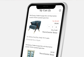
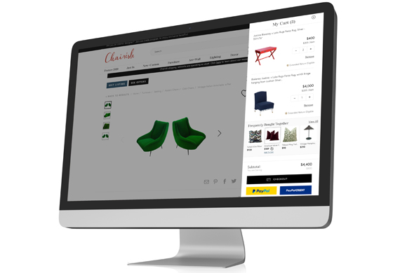
Chairish Shopping Cart
UX. Product Design. Interactive. Case Study.

-
All Grown Up Application
UX. Product Design. Mobile Design.

-
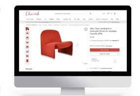
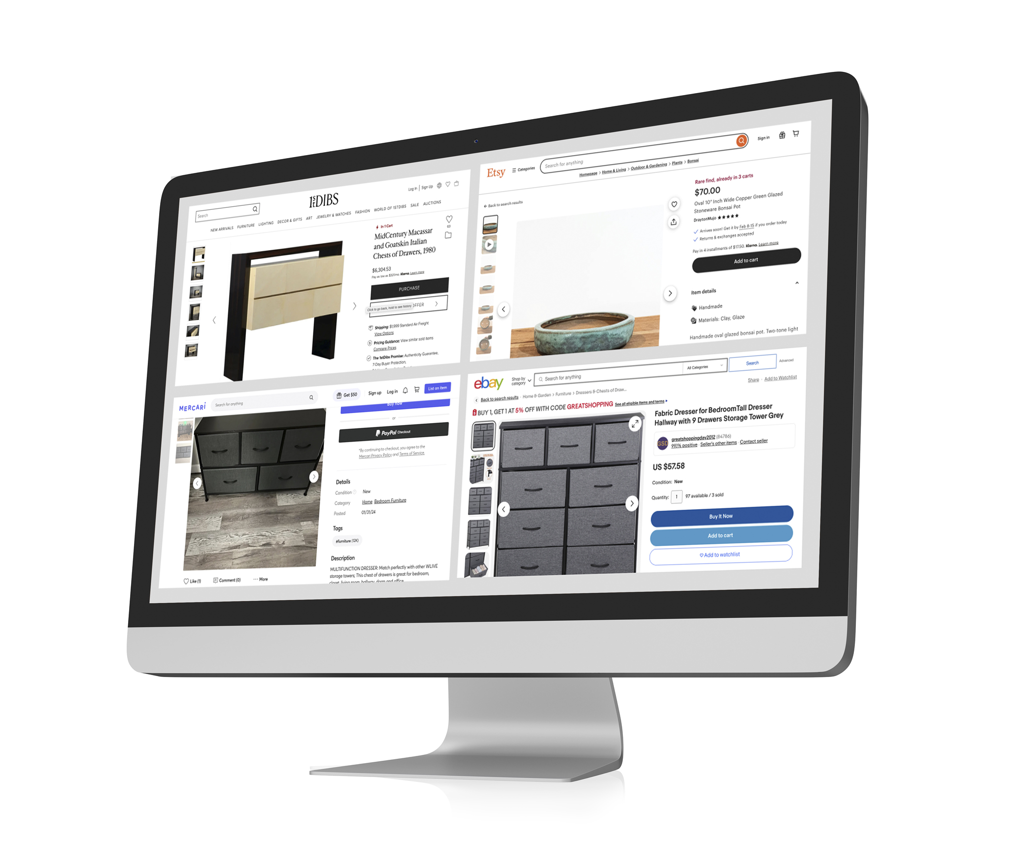
Chairish Cross-Sell Feature
UX. Product Design. Interactive. Case Study.

-
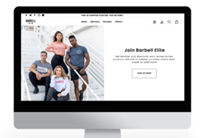
Barbell Membership Landing Page
UX. Product Design. Interactive. Case Study.

-
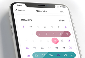
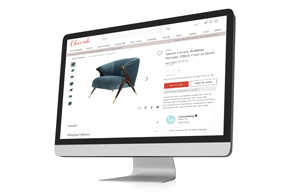
Chairish Estimated Delivery
UX. Product Design. Interactive. Case Study.
-
Chairish International Marketplace
UX. Product Design. Interactive. Case Study.

-
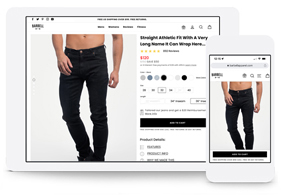
Barbell Apparel PDP Redesign
UX. Product Design. Interactive.

-
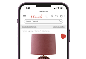
Chairish Favorite Interaction
UX. Interaction. Case Study.
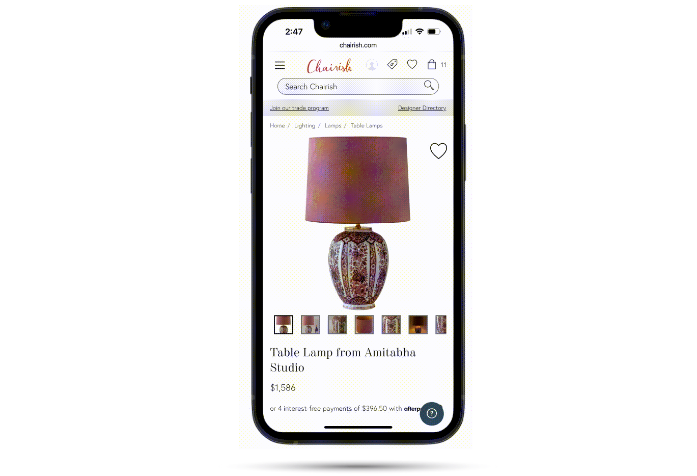
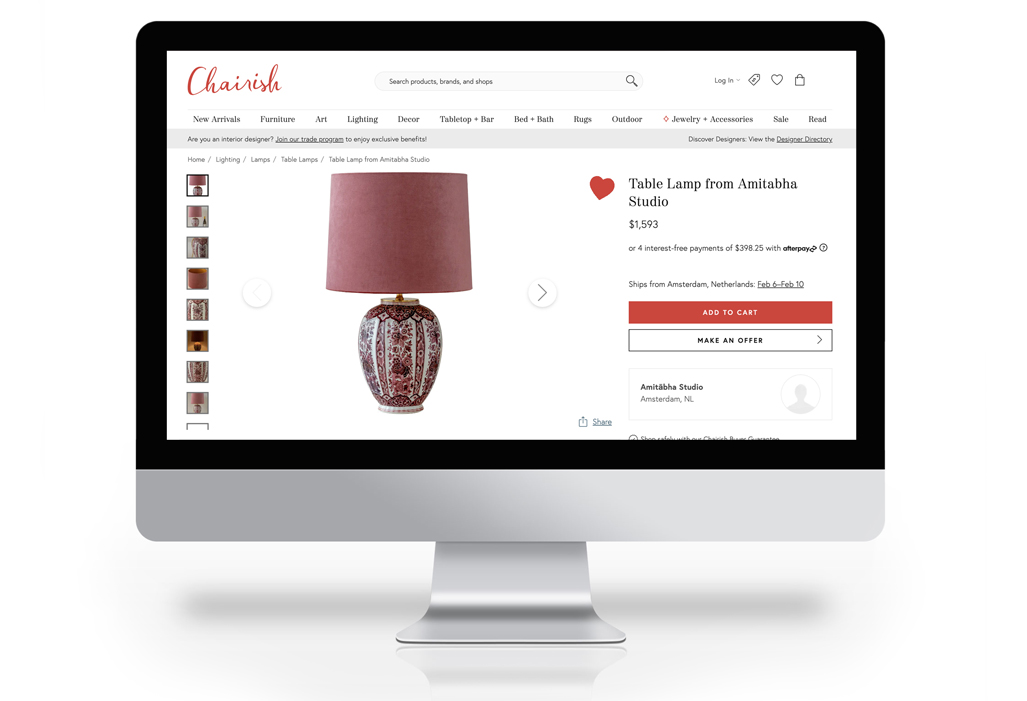
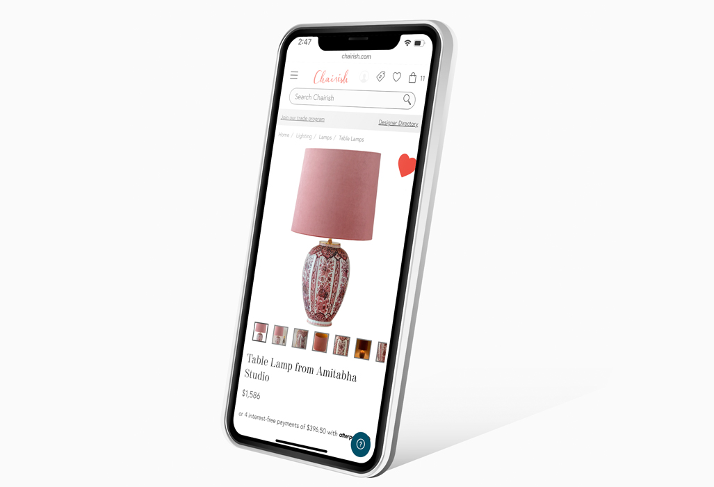
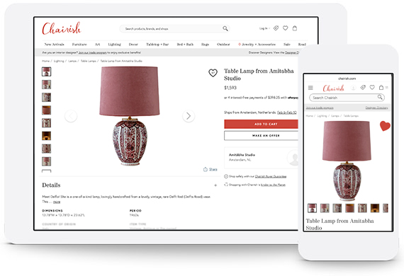
Chairish Favorites Interaction Design
In this case study, we delve into the intricacies of the Chairish Favorite micro-interaction design. As the designer on this project, my primary responsibility was to address the stakeholders' requirements. However, I identified an innovative approach that not only met their requests but also introduced an additional enhancement to the project, as detailed below.
- Mar 4, 2023
- UX. Product. UI.
- Chairish Inc
The Challenge
The stakeholders expressed a desire to incorporate a counter into our favorite icon. In our pursuit of enhancing user engagement and boosting new user registrations, I engaged in a brainstorming session to explore innovative ideas aimed at improving our data metrics.
Product Overview
I proposed solutions that extended beyond merely integrating a favorite counter. I introduced a captivating micro-interaction, strategically placed beneath the favorite icon, designed to seize the users' attention. The intention behind spotlighting this icon was to entice existing users to interact by clicking the heart and encourage new users to sign up through the enticing "Love it, don't lose it" Modal.
Problem
To boost user interaction, encourage favoriting, and attract potential new user signups, our assignment involved integrating a counter into the favorite icon. Recognizing that the counter alone might not suffice to drive increased engagement, we formulated additional solutions. Following several brainstorming sessions, we decided to implement a micro-animation beneath the Favorites Icon on the Product Display pages. The interaction of this animation was carefully crafted to complement the feature while effectively capturing users' attention.
This Project includes:
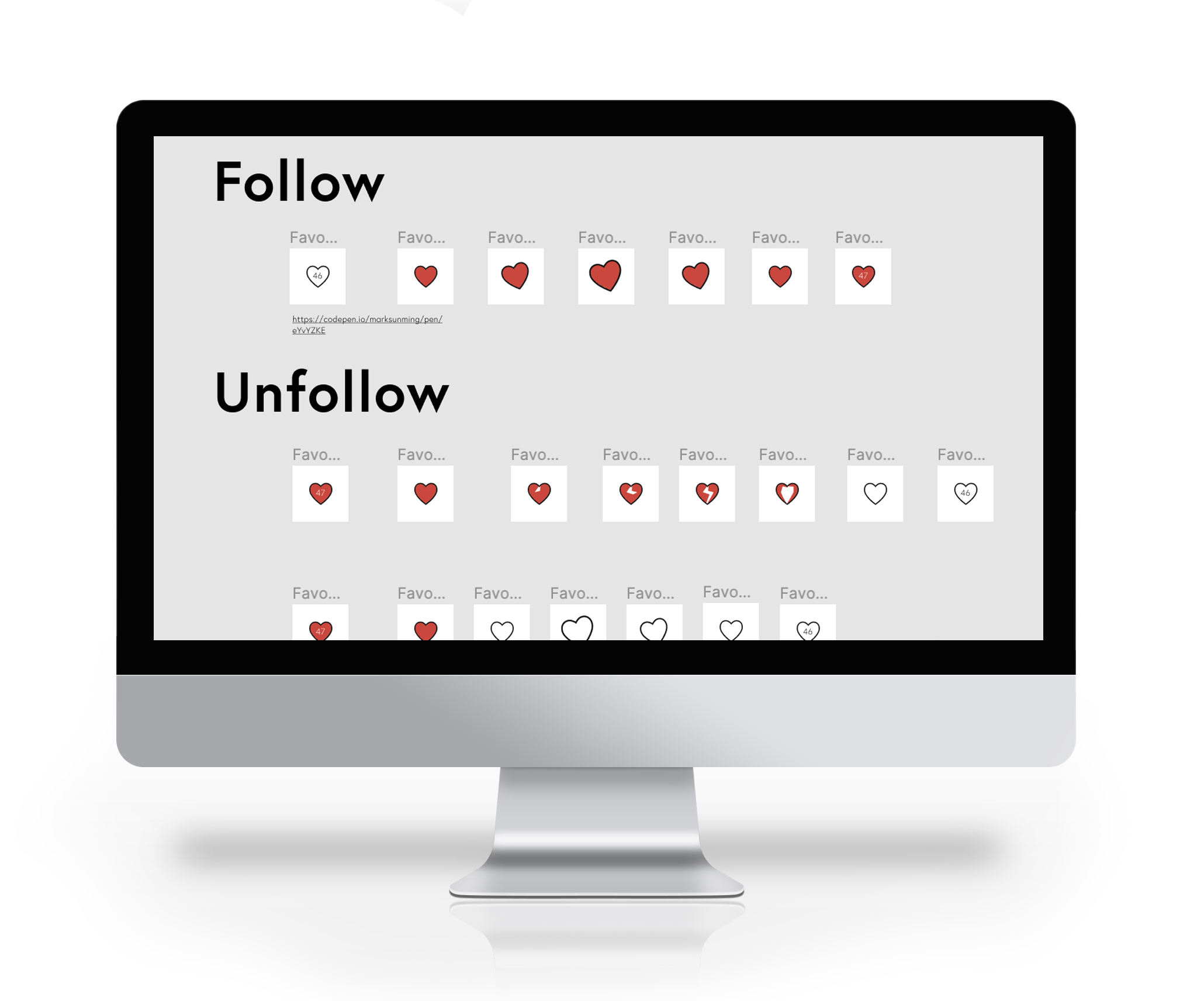
• A favorites counter was added to the icon to display the number of favorites by other users.
• Upon landing on the PDP, the Favorite Icon would animate, drawing the users' eye to the icon (beat twice).
• Upon hover, the Favorite Icon would animate (wiggle).
• Upon Favoriting the icon would animate (Expand).
• When Unfavoriting the icon would animate (collapse).
Overall, these micro-interactions were intended to enhance user engagement and encourage new user signups.
Formative Research
Competitive Analysis: involved evaluating not only the websites of our competitors but also those with exemplary User Interface and User Interaction design.
The aim of formative research was to collect data on prevailing trends and comprehend the presentation of micro-interactions to users.
Initial Design
Design for this project started as one project but was eventually broken into two phases.
Phase 1: Addressing the stakeholder's request to incorporate a counter into the favorite icon. Given the straightforward nature of this request, the design phase was completed relatively quickly.
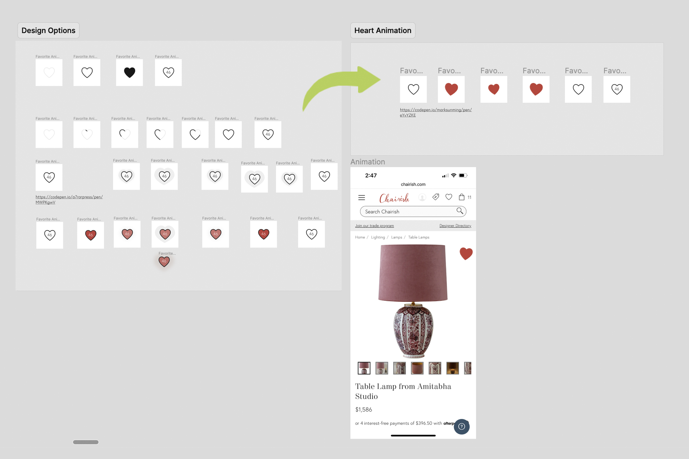
Phase 2: Creating a micro-interaction to enhance the visibility of the Favorite icon. While the design of the animation took slightly longer compared to Phase 1, the efforts invested proved worthwhile. In the image, you can explore various design options, including color change, outer glow, and outline animations.
In the design process, we successfully achieved the following milestones:
• Fulfilled the stakeholders' request by adding a counter to the favorite icon.
• Developed visuals that reinforced our objective to broaden the project scope.
• Expanded the project scope by clearly defining the goals and objectives of the new requirements and specifying their intended achievements.
Observations
The overall evaluation of our designs was positive, with some minor concerns raised about the expanded scope. However, the entire team unanimously agreed that the suggested enhancements would contribute significantly to achieving our goals. To streamline the process, we made the decision to split the project into two tickets: Favorites Counter and Favorites Interaction. The design for the counter has been completed and handed over to the engineering department.
Our feedback for Phase 2 included the following points:
Simple Design: We aimed for an animation that would be visually impactful yet easy to implement.
Reduced Scope: During our initial presentation, we were focused on creating microanimations for various interactions, including landing on PDP (beating), on hover (wiggle), on click (Favoriting - Expand), and on click (Unfavoriting - Collapse).
Iteration
During the design iterations for the animation, we determined that the Favoriting and Unfavoriting interactions were not essential to the goals of this project. Consequently, we made the decision to exclude them from the current scope. We plan to reevaluate these interactions in the future to assess their necessity.
Prototype Phase
In our second round of presentations to the stakeholders, we aimed to eliminate any ambiguity. To achieve this, we developed a prototype that visually demonstrated the interactions from start to finish.
View The Prototype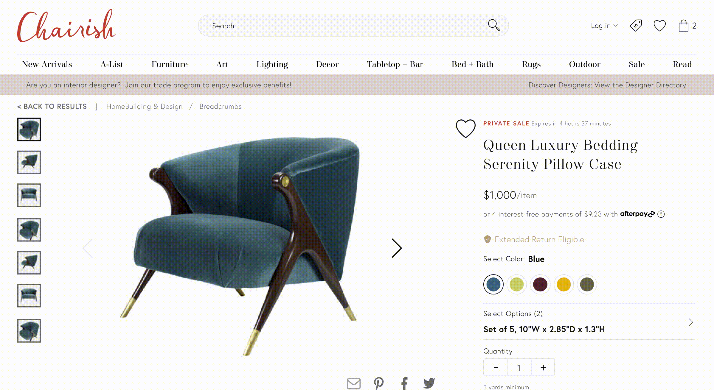
The Feedback
At this stage of the design process, the stakeholders expressed satisfaction with the design. Our feedback primarily involved minor adjustments to the duration of the interactions.
Solution
Our ultimate resolution for the Chairish Favorite Interaction not only fulfilled all the stakeholders' requirements (Favorites Counter) but exceeded expectations by introducing micro-interactions to the Favorites Icon. While this animation expanded the scope, it played a pivotal role in surpassing our original goals.
Reflections
The stakeholder's request to incorporate a counter into the favorites icon was prompted by observing its implementation in our direct competitors' platforms. It would have been beneficial to conduct tests to determine if adding the count of favorites to the icon alone constituted an improvement in user engagement. Despite the separate ticketing of these projects, the data was collectively tracked, making it impossible to pinpoint the true source of improvement. Obtaining accurate data for both phases of this project would have been highly valuable.