-
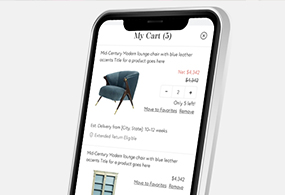
Chairish Shopping Cart
UX. Product Design. Interactive. Case Study.

-
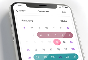
All Grown Up Application
UX. Product Design. Mobile Design.

-
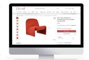
Chairish Cross-Sell Feature
UX. Product Design. Interactive. Case Study.

-
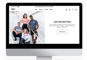
Barbell Membership Landing Page
UX. Product Design. Interactive. Case Study.

-
Chairish Estimated Delivery
UX. Product Design. Interactive. Case Study.
-
Chairish International Marketplace
UX. Product Design. Interactive. Case Study.

-
Barbell Apparel PDP Redesign
UX. Product Design. Interactive.

-
Chairish Favorite Interaction
UX. Interaction. Case Study.
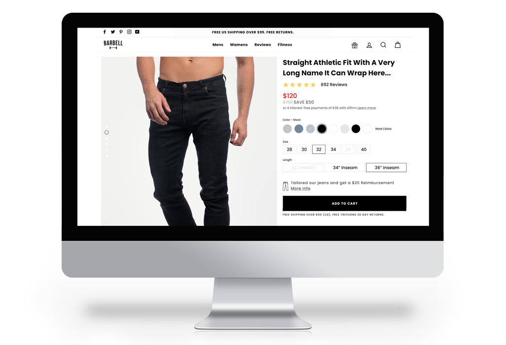
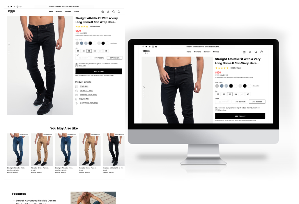
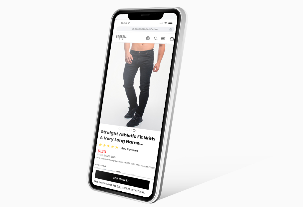
Barbell Apparel PDP Redesign
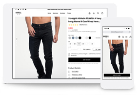
Explore this case study, which centers on the revamp of Barbell Apparel's Product Display Page (PDP), aimed at elevating the e-commerce journey for their athletic stretchy jeans.
In this project, I took a pivotal role, leading UX research and crafting UX/UI designs. Following this, the designs were transmitted to an engineer for seamless integration on the Shopify platform.
- Oct 2, 2022
- UX. Product. UI.
- Barbell Apparel
The Challenge
To revamp the PDP, our goal was to improve its features and establish a more effective hierarchy for presenting product information. While the existing PDP design was functional, there was a requirement for reorganizing content in terms of both page placement and visual weight.
Product Overview
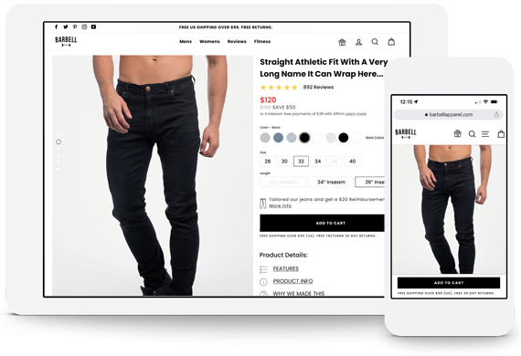
The upgraded PDP incorporates significant improvements, including scrollable product images accompanied by a persistent Call to Action (CTA). Less relevant product details were relocated, and a highlighted video section was introduced to showcase product features. Additionally, a size chart and a recently viewed rail were incorporated to maintain shopper engagement.
Problem
We aimed to create a PDP that prioritizes essential product information above the fold while ensuring easy access to additional details through anchor links. The Call to Action (CTA) and alternate payment methods were strategically placed above the fold. Key feature enhancements included:
Clear Product Information: Detailed specifications, sizes, colors, materials, and relevant details.
High-Quality Images: Ensuring full visibility by addressing previous cutoff issues.
Prominent Call-to-Action (CTA): A fixed CTA that remains visible while users explore the PDP.
Price Information: Redesigned for clarity, showcasing the product price, discounts, and additional costs.
Product Availability: Clear indication of the availability status, whether the product size or color is in stock.
Size and Color Options: User-friendly interfaces for selecting sizes, colors, or variations, if applicable.
Formative Research
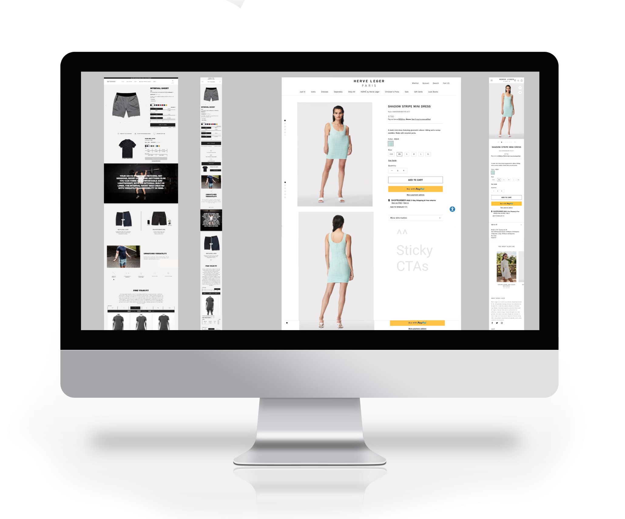
Competitive Analysis: Conducting a competitive analysis involved examining the Product Display Pages of different eCommerce websites to identify common trends that could influence prospective buyers.
Several observed trends were incorporated into the enhancements of this PDP.
Design Options
We underwent multiple design iterations for this project, presenting various options on the right that showcase different approaches to displaying product imagery. Addressing the challenge of Barbell product images with their unconventional aspect ratio – tall and narrow – required creative solutions. Each design option comes with its own advantages and drawbacks.
Throughout the design process, we achieved the following:
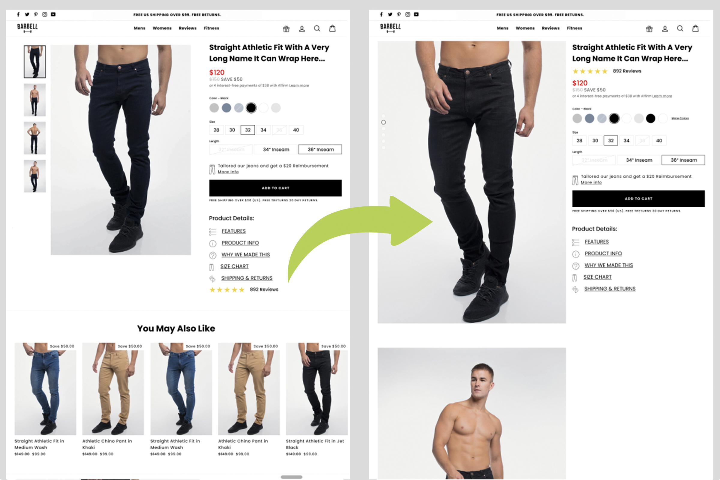
- Facilitated access to reviews by placing a link just below the product title and moved the reviews section to bottom of page.
- Redesign of the Price hierarchy.
- Introduced an expandable "More" link for Colorways, consolidating various product options into a unified PDP.
- Implemented scrolling product images to maintain the visibility of the Call to Action (CTA).
- Restructured product details into sections, accessible through links below the CTA.
- Extended the "You may also like" section to full width for improved imagery display.
- Featured a dedicated Video section to highlight product features.
- Expanded the Size chart for better user comprehension.
- Added a "Recently viewed" section at the bottom of the page to sustain buyer engagement.
Observations
Adopting a Conventional Layout: Following a thorough competitive analysis, we identified several prevailing layout trends that were consistently observed within our study group. These patterns were integrated into our designs.
The feedback on our designs was generally positive, with some minor adjustments incorporated into subsequent design iterations. Stakeholders emphasized the integration of features from two distinct designs, leading to these modifications in the next round of design.
Iteration
Following our formative research and initial presentation, we crafted the high-fidelity Product Display Page. Below are some of the minor adjustments made in this design iteration, encompassing the placement of reviews, enhancements to price display, and refinements in the design of product image display.

Prototype Phase
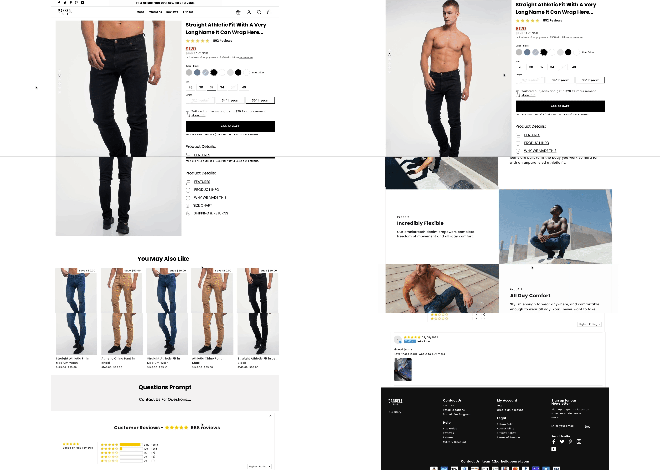
Following the design presentations, we provided stakeholders with a prototype link for independent viewing at their convenience. This prototype enabled stakeholders to experience the page on a desktop device, offering a comprehensive feel of the layout. Constructing this prototype proved valuable in gathering stakeholder feedback before allocating engineering resources.
The Feedback
Stakeholders expressed enthusiasm for the PDP enhancements, and the engineering team was supportive. We did make a few minor design adjustments based on stakeholders' personal preferences, which were seamlessly incorporated into the final design.
Solution
Unfortunately, upon receiving the engineering team's scope estimate for this project, we were advised to scale back some of the enhancements due to resource constraints. While these enhancements are planned for future engineering builds, the current live PDP does not yet fully reflect the final design.
Reflections
Looking back at our PDP design process, I wish I had consulted with the engineers earlier to obtain a time estimate and included it in my presentation, potentially avoiding the last-minute scope reduction. This could have enabled us to approach the redesign of the PDP more methodically, releasing phases systematically rather than fitting tasks into whatever blocks of time were available for the engineers.

